There are some customers who have a very clear idea of what they want when they order a cake. They ask for a rainbow of colors and give you very definite instructions about where to place every bow, polka dot and stripe. Many times, they will provide a photograph of a cake they’d like you to use as inspiration.
But every once in awhile, a customer comes along who says, “I want a beach cake – surprise me.” Or maybe you’re creating a cake for a friend and have total creative freedom. You are so excited! But where do you start? The possibilities are endless! And maybe a little bit terrifying.
Picking a color scheme for a cake is not always easy. It’s tempting to break out your box of gel colors and go a bit wild. You love hot pink teamed with coral, but teal is so ‘now,’ but red’s your favorite color and you have that new purple fondant you’ve been dying to try. Sometimes though, working with a carefully selected palette of three or four colors along with black and white yields the most attractive results.
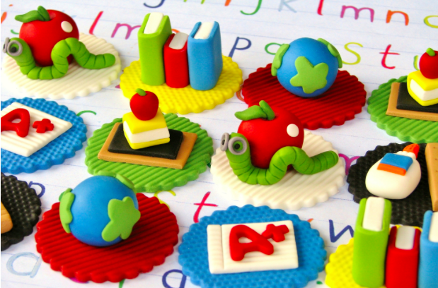
Photo via Lynlee’s Petite Cakes
These cupcake toppers by Lynlee’s Petite Cakes are the perfect example. She’s chosen the primary color palette (plus green) and added black and white. I call these ‘crayon colors.’
So, that’s easy, right? Everyone knows primary colors work together. We’ve all seen those color wheels that show primary, secondary and tertiary colors.

But what about this set, also by Lynlee? The orange and purple are ‘secondary’ colors. They’re meant to work perfectly together. So how come they look so fabulous teamed with red?
So how do you know which colors work together? Primaries, secondaries, tertiaries? The mini cakes above prove that you don’t have to stick to the rules of the color wheel to create a palette that works.
You can find those old-fashioned color wheels that show which shades complement each other and which contrast online. But there are newer, higher-tech and, frankly, more gorgeous methods to help with picking a color scheme for a cake. My personal favorite is Design Seeds.
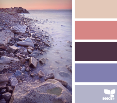
Photo via Design Seeds
Even if you don’t have a cake to design, it’s hard not to get lost in this beautiful website. Spend a little time scrolling and you’ll be presented with exquisite color palettes taken from nature, food, art and more.
Chances are you’ll be inspired within the first few minutes. But if you want to search for a color scheme for a specific theme – that beach cake for example – click the Palette Search button and choose maybe ‘The Sea,’ ‘Summer’ or ‘Vacation’ from the options presented to you.
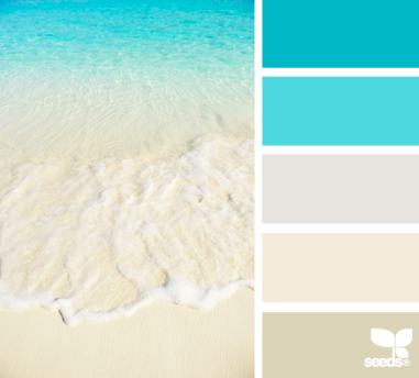
Photo via Design Seeds
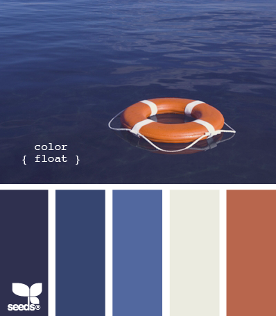
Photo via Design Seeds
Alternatively, the slider option allows you to search for schemes that center around a certain shade.
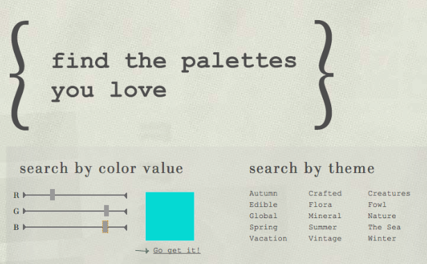
Photo via Design Seeds
You can feel confident that colors found together in nature will look beautiful when transferred to your works of art, whatever they may be. (Don’t be surprised to find yourself desperate to redecorate the living room!)
Using a limited number of colors when designing a cake will give a consistent feel that will please the eye. You’ll notice that most of the Design Seeds examples above actually include a maximum of three different ‘colors,’ the rest are ‘values’ of one of them. Or, to put it simply, shades of the same color. The sample above called ‘Color Float’ includes a brick red, a neutral eggshell and then three shades of blue.
So you’ve chosen your color scheme. Now what?
Lynlee North Beckett from Lynlee’s Petite Designs says, “The key to working with multiple colors is to determine your palette and plan it out ahead of time to ensure it makes a balanced, cohesive statement. When working with cupcake toppers specifically, with the understanding that your eyes will automatically be drawn to certain colors, I alternate between the bases evenly and spread out these stronger colors within the details of the other designs. Color is just as important as designs to emphasize the desired aspects, while maintaining a proportionate display.”
When decorating cakes as opposed to cupcakes, choose one or two colors from your scheme as background shades and use these to cover your cakes in buttercream or fondant. Create your accent pieces from the other colors in your palette and darker or lighter variations of them, adding ‘neutral’ colors like black, white or brown as needed.
This spectacular beach cake by Gateaux, Inc uses shades of just sandy brown, blue and green. The color scheme looks like it came direct from the Florida coastline, or right off the pages of Design Seeds.
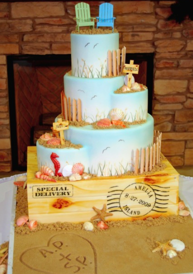
Photo via Gateaux, Inc
“We really worked on giving the colors that hazy Atlantic beach look rather than a more tropical Pacific vibrant aqua feel,” explains Robin Martin, owner of Gateaux, Inc. “The bride and groom were married on Amelia Island in Florida in a private ceremony because he was being deployed by the military. This cake was created 16 months later in Minnesota for a reception with their friends and families.”
But you don’t need an extensive color scheme to design a beautiful and striking cake. Sometimes just two colors will create an unforgettable centerpiece!
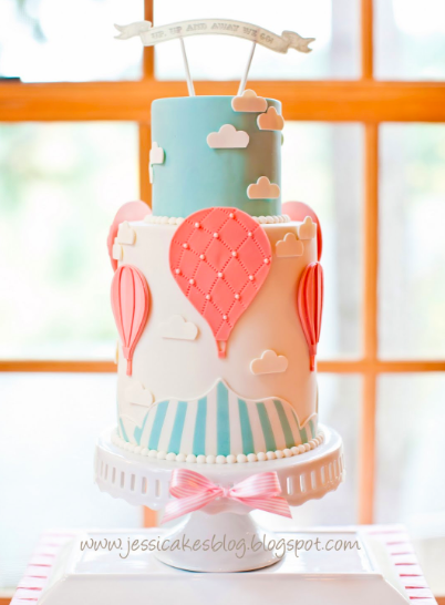
Photo via Jessicakes Blog
This hot air balloon cake by Jessica Harris uses just two colors – teal and shades of coral – along with a neutral background of white. Jessica is well-known for making cakes in an artistic and graphic style. She proves that less can certainly be more.
So if you’re sitting at your kitchen table with a blank piece of paper, a brand new set of felt tip pens and a cake to design, my best advice is to pick one colour you love. Then pick another one. And then stop. They don’t have to ‘match’ – you might have chosen orange and hot pink. Navy blue and red. Purple and lime green. Oh, yes you can! One of the two colours you have chosen will be your accent color – one you probably use the least of on the cake, but probably the one that most arrests the eye.
The other will give you a range of colors to work with as you draw on its lighter and darker shades. Choose a neutral to be the glue that brings everything together: white or ivory, grey or beige. The palest shade of your main colors will also work. Don’t be afraid to add touches of black or dark brown as needed. As you gain confidence, you can flip things around and start working with black, chocolate brown or navy blue as your neutral color and create a palette of brights or pastels to contrast with your dark and moody backdrop.
Designing with color is definitely not something to fear. By following a few simple guidelines and using tools like Design Seeds, Kuler or ColorMunki to help refine your color ideas, you’ll be creating consistently beautiful cakes that are a feast for the eyes as well as the tastebuds!
I recently indulged myself when I created an Icing Smiles cake using a color palette of turquoise, pink and red along with black and white. It’s a scheme I’d been dying to try and I was so pleased with the results. Next on my bucket list is navy blue and orange like this eye-catching creation by Miso Bakes.
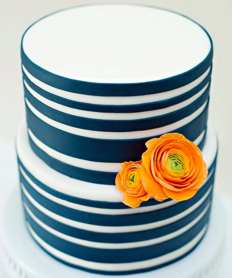
Photo via Miso Bakes

Share tips, start a discussion or ask one of our experts or other students a question.
No Responses to “Cake Designing in Color – It’s Not Always Black and White”