
Color. It’s the reason so many quilters love fabric and fill their shelves with it. Fabric color can evoke a particular feeling or mood when you look at a stack of Fat Quarters. It’s for that reason that choosing a color palette for quilting projects is so important! Because many quilts take weeks, months or even years to assemble, you’ll inevitably look at those chosen quilting fabrics for a good, long while.
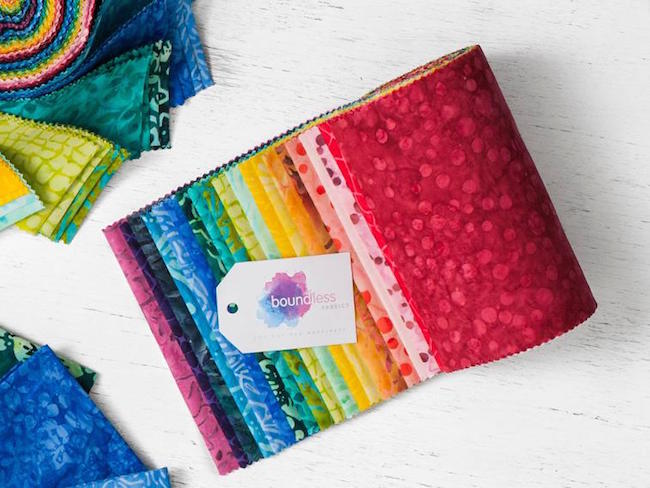
Boundless Batiks Rainbow Precut Fabric
So, how you choose color palettes as it relates to your craft? There’s no right or wrong way to pick colors, but we’d like to take a closer look at how to choose a color scheme in quilting, with a focus on tone and value. Let’s dive in!
Tone: warm or cool
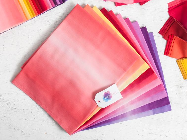
Boundless Blenders Ombre Sunset Precut Fabric
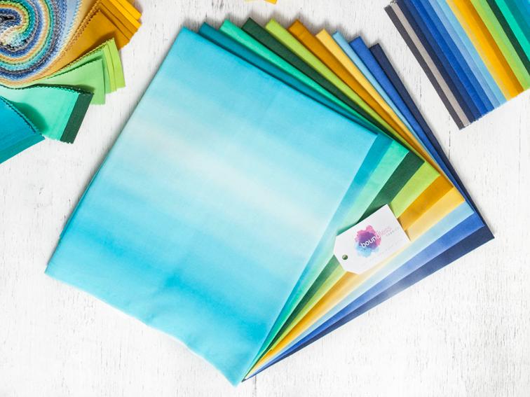
Boundless Blenders Ombre Waterfall Precut Fabric
One way to choose a color palette is to look at the tone of the fabrics. In general, warm colors are reds, oranges and yellows, while cool colors are blues, purples and greens. In the photos above, you’ll notice that the warm fabrics (top) also contain some purple, while the cool fabrics (bottom) include a warm sunshine yellow.
In quilting fabrics, warm colors can be energetic and cool colors tend to be calming, so your use of one over the other will probably evoke a certain feeling to your work.
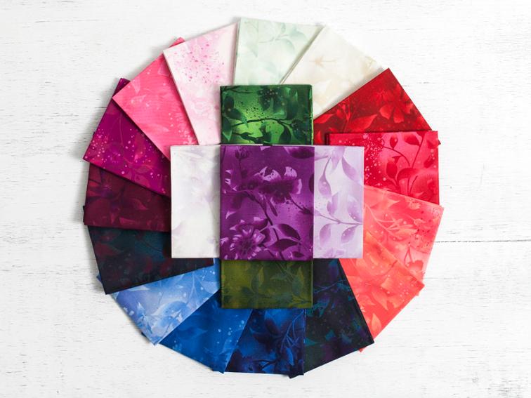
Boundless Blenders Botanical Eden Precut Fabric
Mixing warm and cool colors is a great way to choose a color palette. For instance, you may choose one warm, one cool and one neutral color. In the fabric spread above, reds and pinks (warm), blues and greens (cool) and navy and white (neutral) make a beautiful combination.
Colorblock Quilt Kit
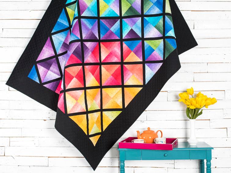
If you choose to make a quilt with only cool fabrics or all warm fabrics, you’ll have a harmonious color palette that blends together well. However, mixing the two color tones will give you greater vibrancy, as you can see in Nancy Smith’s Colorblock Quilt pictured above.
Value: light or dark
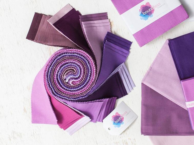
Boundless Solids Purple Passion Precut Fabric
Value is a fairly basic element of choosing quilting fabrics, but is often overlooked when planning a project. The value of a fabric has to do with how light or dark the color is. The purple fabrics above are arranged from darker to lighter values.
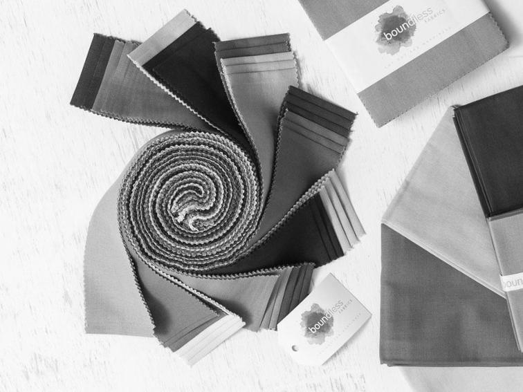
When comparing the values of different colored fabrics, a good trick is to take a photograph and then translate that photo to black and white. The colors with more white have a lighter value, and they contrast well with darker valued fabrics. When you choose fabrics with contrast, your piecing will be more visible.
Resources for choosing colors
- If you’re still stuck on what colors to use in your next quilting project, you could consider the colors of the season (from changing leaves to summer skies). Holiday colors (Christmas, Halloween, Easter) are also a popular choice for selecting quilt fabrics.
- Draw inspiration from a single fabric print. Pull similar colors of fabric for your next quilting project.
- Design Seeds is a wonderful website for choosing a color palette for quilting. Colorful photographs are paired with color swatches, which many quilters use as a jumping-off point for pulling fabrics.
- For additional tips on choosing a color scheme, visit Tiger Color and learn more about the color wheel and color interactions.
How do I purchase?
Looking for Boundless Craftsy fabric