
When anyone mentions a color wheel to me, I can’t help but think of my nostalgic middle school art classes, where I learned about art history and how the color wheel worked all the while passing a few notes to my fellow classmates. However, not until I was a few years into having a craft blog did I realize how much you use a color wheel on a regular basis.
Here are a few tricks and tips I’ve learned along the way that will help you pick the perfect color scheme every time for card making and scrapbooking projects.
Photo via Brandi Girl Blog
New paper crafts classes are now available on Craftsy! If you’re new to Craftsy, explore our online learning platform today by signing up for one of our completely FREE mini-classes: Spectacular Stamping with Joy Macdonnell and Create Stunning Birthday Cards with Kimber McGray.
Let’s start with a basic overview of the color wheel
There are 3 primary types of color combinations that we deal within the wheel:
1. Primary colors: red, blue and yellow; these colors make up all the other colors.
2. Secondary colors: orange (red + yellow), purple (blue +red) and green (blue+yellow).
3. Tertiary colors: red-orange, red-violet, yellow-orange, yellow-green, blue-violet and blue-green; the colors are made with the primary + secondary colors combined.
Now in what ways do we actually use this and what does this even have to do with paper crafting?
When choosing paper for your card making and scrapbooking, there are typically a million designs, patterns and colors involved. Everyone usually has that “stash” of leftover papers from previous projects. These stashes can be the creators of colorful paper crafts if you know what you are doing.
When picking out card color schemes here are a few basic elements:
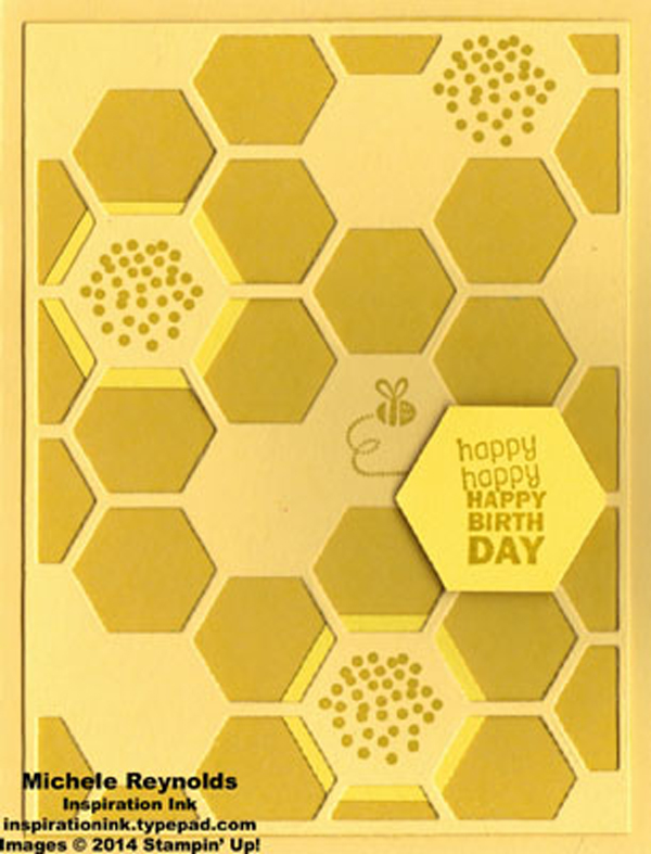
Photo via Inspiration Ink
1. Monochromatic scheme
This is dealing with colors that fall within the same hue of a single color. See how in the photo above Michele Reynolds of Inspiration Ink took the primary color yellow and then incorporated mustard yellow, bright yellow and a little bit of golden yellow. The result is so fun! If you want to use this scheme, just examine the colors closely to make sure you are balancing the darker hues with lighter shades so that you are not needing sunglasses or night-vision goggles to read the words.
Photo via Omiyage Blogs
2. Analogous color scheme
This involves colors that appear beside one another on the color wheel. As you can see in this birthday card above, the colors used were hues of blue and red, which are BFFs on the color wheel. In using this method, just be sure to have a color wheel handy so you can glance at it when you’re at the craft store picking the perfect paper, stickers and accessories for your project.
Photo via Craftsy member Aleta W
3. Triadic color scheme
This is probably the most used color scheme for scrapbooking and card making as this method involves using typically three colors that are evenly spaced around the color wheel, balancing warm and cool shades. Craftsy member Aleta W did a fantastic job making this adorable cupcake birthday card in complementary green, blue, yellow and red hues. When using this type of scheme, it’s super important to remember to let one color dominate (red in this example) and use the other colors as highlights. It gives a strong visual contrast while maintaining full color wheel balance.
A few more tips for choosing perfect color palettes for paper crafting:
Be inspired by the colors you see around you
Look through magazines, Pinterest or take a walk and look at the colors that blend together so perfectly in art and nature to be inspired for your next scrapbooking or card making night. Most importantly, don’t forget to write down the color combinations that inspire you so you don’t forget!
Use a color swatch book
Keep a swatch book, like the Color Coach, in your purse for your crafting adventures. These color palettes allow you to match up the color you see and on the back it lists out colors that would complement it well. This even makes a great gift for your crafty neighbor or best friend.
Keep the bold patterns to a minimum
It’s important to make sure that if you are using a heavy patterned print, like a floral, to examine the colors used in this main pattern and stick to more basic patterns (like stripes) involving those same colors.
Have fun with it!
Always remember that crafting always takes time and patience, so if you begin pairing two colors together and just don’t seem to love it, don’t sweat it and just keep working to find that perfect match for your project.
Share tips, start a discussion or ask one of our experts or other students a question.
No Responses to “Tips for Choosing Perfect Color Palettes for Your Paper Craft Projects”