
There are times when choosing the right color combinations for your artwork will be a daunting decision. You may just be using a couple of colors, many colors, or just need the one right color. I have an easy solution for making the perfect color choices for your artwork.
The colors in your artwork are as essential as the composition itself. The right colors can make all the difference in the world whereas poor color choices can detract from a piece of work.
Sometimes you are sure all along of the right colors to use and other times you will find yourself more and more unsure as you come to the final touches of your piece. It could be one flower or a little dress, or even a few objects that you need to figure out the right color or color combinations for. I am going to share a tried and true method for choosing colors to make your artwork at its very best.
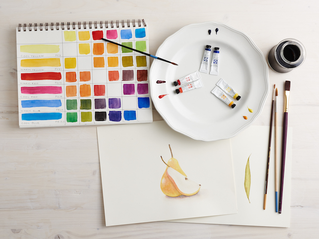
You may be keeping a reference library in the form of books, photos, tear outs and photocopies but it is also a good idea to keep a color reference library as well. This can be in the form of color theory books, a color wheel, colorful sheets of construction paper or even paint chips from the hardware store.
Just pulling out some of these color samples and laying it on or near your work might be enough to make up your mind on which color(s) to use. You can certainly begin the process of elimination this way.
Play with your color wheel to find complementary colors. If you are still coming up short choosing colors, try this:
Step 1.
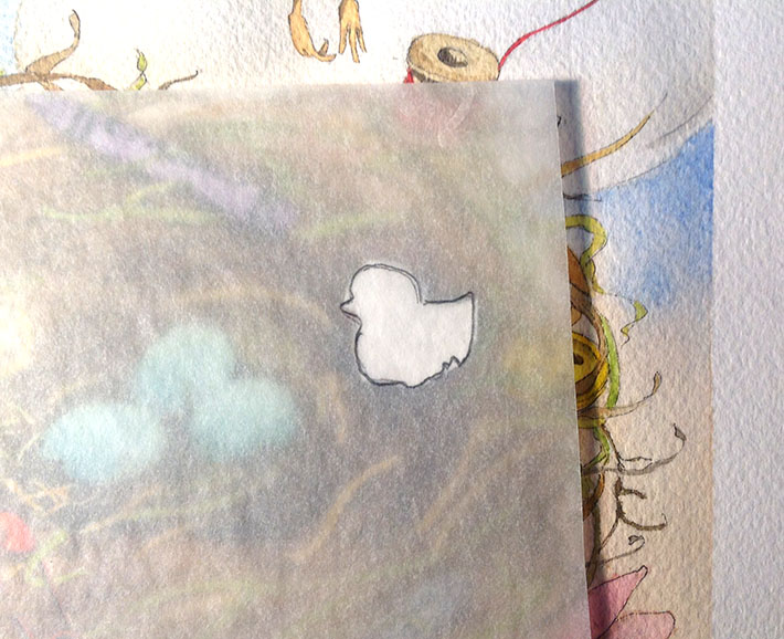
Take a sheet of tracing paper and trace the object that you are choosing the right color for.
 Step 2.
Using a transfer sheet, transfer the outline to a clean sheet of paper (preferably similar to the surface of your painting). Place the transfer sheet right side down on your surface, lay the image you want to transfer on top and secure it with some masking tape. Use a 2H pencil to trace along your image, pressing the lines from the graphite right onto your surface. Do not press too hard, just enough to imprint the shape.
Loving this tutorial? Download this easy, printable PDF, and enjoy it anytime, anywhere, forever!
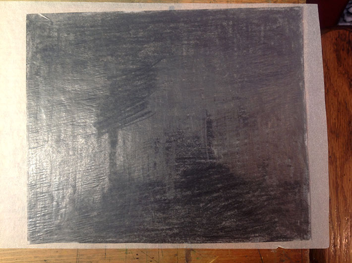
Tip: To make a transfer sheet, all you need is a piece of tracing paper and a soft pencil (I make my transfer sheets about 6″ x 8″). Cover the sheet with graphite by heavily shading it horizontally, vertically and diagonally until it is covered. Save this transfer sheet since it is reusable many times over. And you can refresh it after that.
 Step 3.
Paint and cut out your shape and then lay it on your painting to see how the color works.
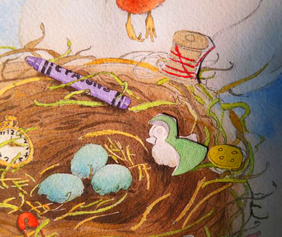 Play with your color ideas this way, even leave them sit on the painting and come back after a while and see how you feel about the choice. This method is the most absolute way to get the color you want.
Tip: You might find that your perfect color is the same color that you have already used in your painting. You may still be able to use it by changing the shade of the color to create a variety.
Notice in the image below that I have three shades of yellow in close proximity — the pocket watch, grass and button, but the variation of shade keeps it from becoming redundant.
 What methods have you used find the perfect complementary colors for your artwork?
Share tips, start a discussion or ask one of our experts or other students a question.
No Responses to “Colors of Art: Choosing Colors to Complement Your Work”