
Fact: no one wants a dull painting. But that doesn’t mean you should overlook the power of mixing muted and dull colors. These seemingly drab tones will help your paintings reach a whole new level of depth and realism, and it’s all done with an understanding of color intensity.
Color intensity refers to brightness or dullness, and the intensity scale is made up of hue and tone. Hue is when a color is fully saturated, meaning it has not been neutralized by its complement, and the colors that have the highest possible level of saturation are called pure hues. Tones are made when you add another color to a hue.
Having a strong grasp of color intensity helps your paintings look more realistic. In real life, the colors we see around us — especially in nature — tend to be muted versions of the ones in our paint tubes. Painting the leaves of a palm tree, for example, with an intense green hue can make it look less realistic and flat. (Unless you are consciously painting a high-intensity piece with vibrant hues — just keep in mind that too much color vibration and intensity can be hard to look at.)
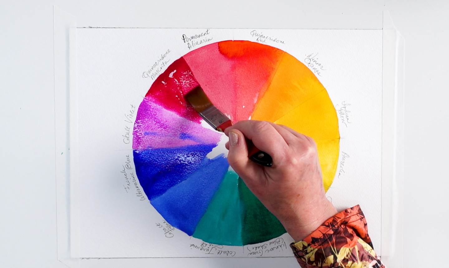
Color intensity scales aren’t done by adding black or white — they’re made by pairing complementary colors. The easiest way to find those pairs is by looking at a color wheel: complementary colors are opposite each other.
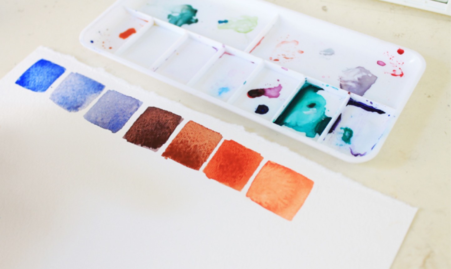
To create an intensity chart, begin by picking a pair of complements. We started with blue and orange, but you can choose yellow and purple or red and green.
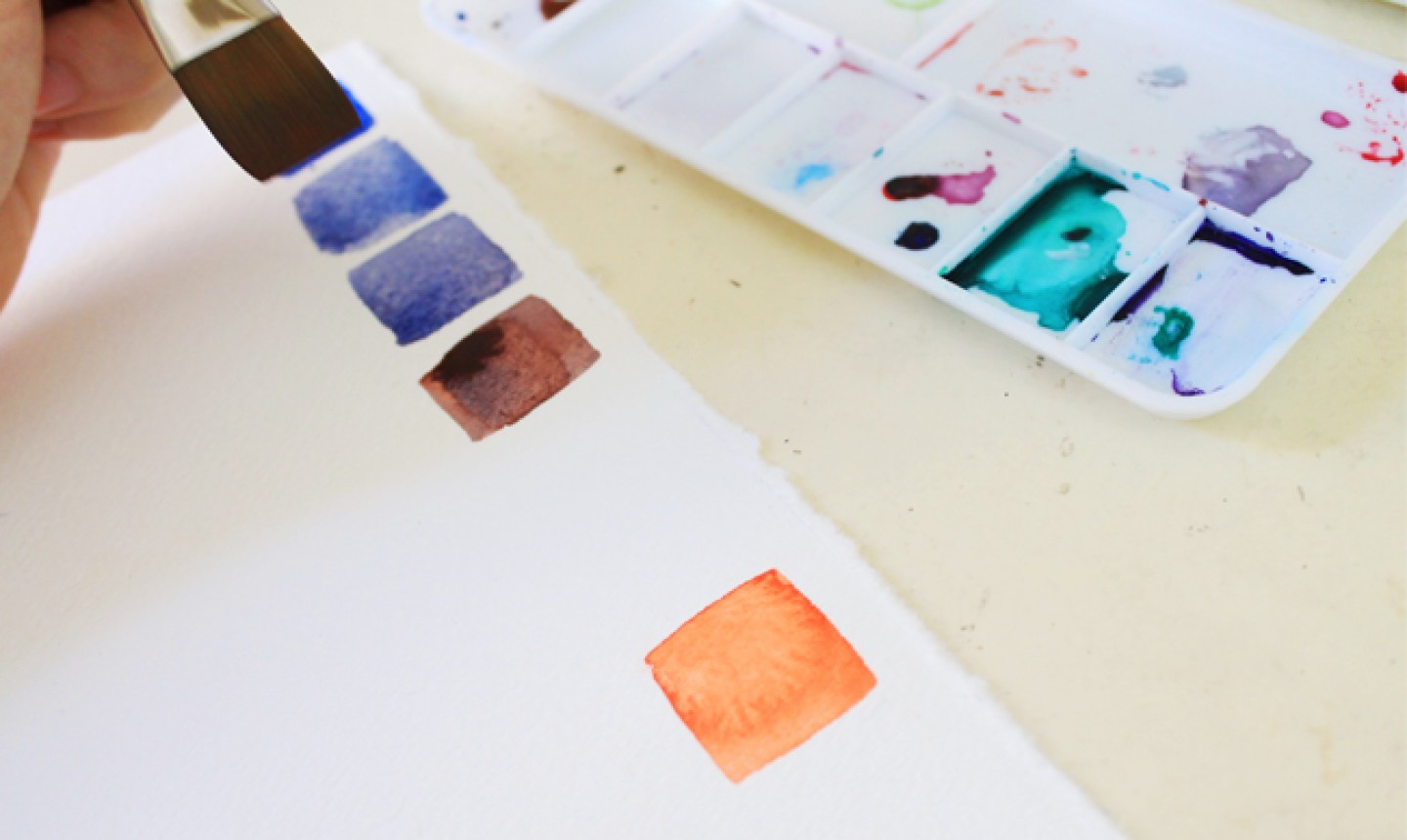
Begin by swatching blue and orange in their purest hue, straight from the tube or pan , at either side of your scale. Then begin to incorporate small drops of orange into the blue on your palette. Even the smallest drops will create a slightly muted tone.
Keep adding drops of orange until you have a 50/50 mixture in the center of your scale. Then, incorporate small drops of blue into your orange to create the swatches on the other side.
Notice how the hues that are closest to their true complement on the color wheel tend to mix into a more neutral gray. In theory, mixing the exact opposing colors on the color wheel in equal parts will result in that shade.
This exercise is simple, but powerful. Save this sheet for reference in future paintings so you know how to achieve realistic tones. And remember: the key to achieving realism is in pure observation; knowing when you need a vibrant hue and when the atmosphere calls for a more muted tone (like when painting a winter sky).
Looking to get started with watercolors? Check out the class Startup Library: Watercolors below!
Share tips, start a discussion or ask one of our experts or other students a question.
Already a member? Sign in
No Responses to “How a Color Intensity Chart Can Help You Paint Realistic Watercolors”