While the sheer spectrum of colors available to painters might seem infinite and complex, there’s actually a definite and, at its core, fairly simple order to the world of color.
In exploring color theory, you’ll start to understand the inner workings of the rainbow, which can increase your understanding of tone, color relationships and creating custom colors with paint. This knowledge can help inform your color choices in painting, but can be applied to any type of art you do, be it drawing, quilting or cake decorating.
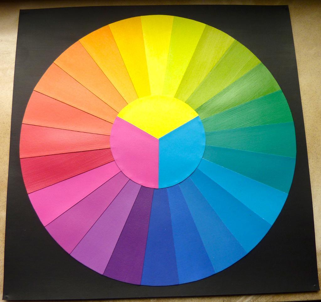
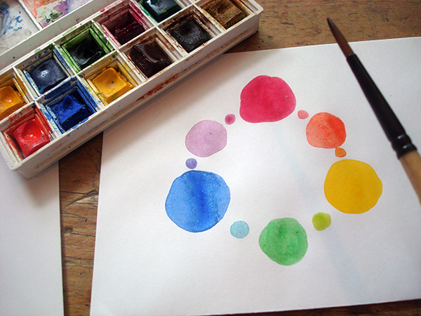
Color wheel via Craftsy member Dunkelgod
In this post, we’ll introduce some basic color theory concepts, from the color wheel to types of color relationships, as well as several exercises to try at home to assist in your practical application of color theory in painting.
The color wheel
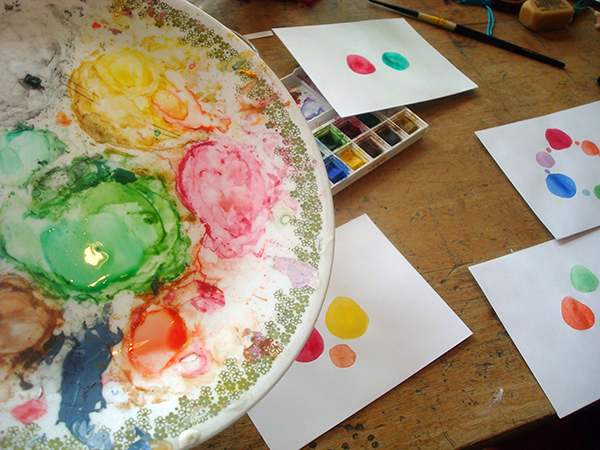
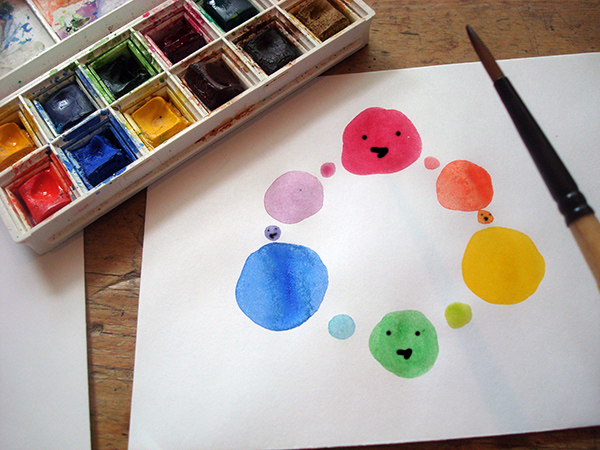
Photos and illustrations via CakeSpy
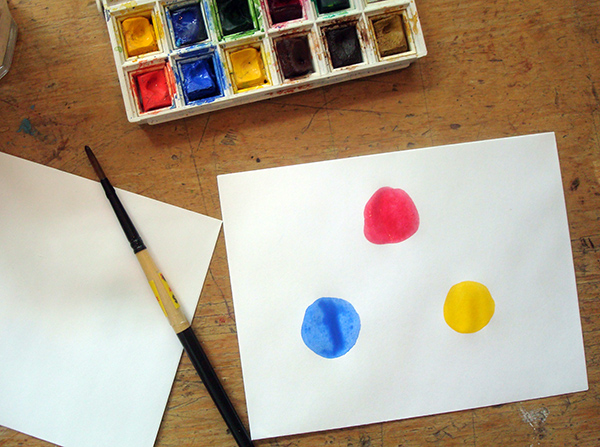
A good place to start in exploring color theory is the color wheel. Why is it a wheel? Well, think of it this way. You start with a triangle of the primary colors: red, blue and yellow.
These are the colors that are the basis of all others — they can’t be mixed.
Note: White is also a color that cannot be mixed, but we’ll talk about that later, when we discuss value.
Then, add in the secondary colors. These are the ones that can be mixed, directly from the primary colors. For example: red and yellow make orange; blue and yellow make green.
Now, add in the tertiary colors, which are more faceted variations made by combining equal parts of a secondary and primary color (yellow-green, red-violet, etc.). Colors can become more specific from here.
While the below color wheel shows 12 colors, you could increase yours to a much grander proportion.
All of a sudden, you can see why it’s considered a wheel! This wheel provides a powerful guide which can inform our painting by teaching us about color relationships, which can in turn help us choose color schemes for our work.
Color wheel glossary
When discussing the color wheel, there are some key terms:
Hue
Hue is, simply speaking, the color in question. The colors of the rainbow — red, orange, yellow, green, blue, violet — are all examples of different hues.
Chroma
Chroma is the saturation or intensity of a particular color. In general, the more pure the color, the higher the chroma. This can be confusing, as it sounds similar to value, but while value refers only to the lightness or darkness, chroma is the saturation or color intensity.
Value
Value refers to the intensity of a color based on a sale from light to dark. White and black can make a color much more muted or deep, respectively. While value is easy to see in a black and white photo, it is harder to discern with color because the colors surrounding one another can create the illusion of value.
Painting project
Try working on a piece by choosing one hue, and creating a piece of artwork by only adding either black or white to the color. You’ll be amazed by how many different values you can find within the same piece.
Color relationships
How do colors relate across the wheel? Here are some ways that can easily be applied in painting.
Complementary colors
Complementary colors are opposites. On the helpful color wheel, they’ll be polar opposites from one another. Red and green, violet and yellow, orange and blue. Often, pairing these colors can create a striking visual.
Painting project
To better understand the relationship between complementary colors, try creating a painting only using complements. No black and white: simply mix the complements in different degrees to create a piece of work.
Analogous colors
Analogous colors refer to the colors which appear next to one another on the color wheel. Typically, one of them will be a more “dominant” color, either primary or closer to it. Using analogous colors in a piece can help you attain a more dimensional look within a color scheme.
Triad colors
If you look at any triangle of colors in the color wheel, you have a triad. Choosing a triad of colors can be a fantastic way of choosing a basic color scheme for a piece of artwork. Move beyond primary colors and choose a triad of secondary or tertiary colors for a unique look.
Split complementary colors
This is a tighter triangle on the color wheel, in which you choose a color and then the hue on either side of its complement. It combines aspects of triad colors and complementary colors, and will yield a slightly different color scheme which can prove quite compelling in a painting.
Square colors
It’s hip to be square when you choose colors from the wheel. Choose colors evenly spaced from one another (in a color wheel with 12 different hues, that would be every third hue). On a professional color wheel, this will form a perfect square, where it is slightly looser in the more illustrative image above.
You probably get the idea by now, but by choosing colors within a grouping that follows geometry, you can often find a great way to create a color scheme. You can expand your color wheel to have as many slight variations between shades to create complex color schemes.
Now that you have a basic understanding of color relationships, it’s time to get painting.
Share tips, start a discussion or ask one of our experts or other students a question.
No Responses to “Paint the Rainbow: Exploring Color Theory in Painting”
No Comments
Get Access
Premium Membership
Unlock exclusive member content from our industry experts.
24/7 Access to Over 2,000 Premium Classes and Hundreds of Instructional Videos Across 20+ Categories
Extensive Library of Downloadable Patterns and Recipes
Stream and Download Classes Anywhere with the Craftsy App
Share Your Membership with up to 3 Friends or Family Members
Access to Ask the Expert Program
Admission to Exclusive LIVE Streaming Virtual Events
Get exclusive premium content! Sign up for a membership now!
This site uses cookies and other technologies to track your use of the site that will allow us and our service providers and partners to enhance your experience and deliver relevant content to you. By agreeing to or closing this notice, you understand and agree to such use and data collection. For more information about our privacy practices and your choices, please visit our privacy policy and cookie notice.

 Color wheel via Craftsy member Dunkelgod
In this post, we’ll introduce some basic color theory concepts, from the color wheel to types of color relationships, as well as several exercises to try at home to assist in your practical application of color theory in painting.
Color wheel via Craftsy member Dunkelgod
In this post, we’ll introduce some basic color theory concepts, from the color wheel to types of color relationships, as well as several exercises to try at home to assist in your practical application of color theory in painting.
 Photos and illustrations via CakeSpy
A good place to start in exploring color theory is the color wheel. Why is it a wheel? Well, think of it this way. You start with a triangle of the primary colors: red, blue and yellow.
These are the colors that are the basis of all others — they can’t be mixed.
Note: White is also a color that cannot be mixed, but we’ll talk about that later, when we discuss value.
Photos and illustrations via CakeSpy
A good place to start in exploring color theory is the color wheel. Why is it a wheel? Well, think of it this way. You start with a triangle of the primary colors: red, blue and yellow.
These are the colors that are the basis of all others — they can’t be mixed.
Note: White is also a color that cannot be mixed, but we’ll talk about that later, when we discuss value.
 Then, add in the secondary colors. These are the ones that can be mixed, directly from the primary colors. For example: red and yellow make orange; blue and yellow make green.
 Now, add in the tertiary colors, which are more faceted variations made by combining equal parts of a secondary and primary color (yellow-green, red-violet, etc.). Colors can become more specific from here.
While the below color wheel shows 12 colors, you could increase yours to a much grander proportion.
Now, add in the tertiary colors, which are more faceted variations made by combining equal parts of a secondary and primary color (yellow-green, red-violet, etc.). Colors can become more specific from here.
While the below color wheel shows 12 colors, you could increase yours to a much grander proportion.
 All of a sudden, you can see why it’s considered a wheel! This wheel provides a powerful guide which can inform our painting by teaching us about color relationships, which can in turn help us choose color schemes for our work.
 When discussing the color wheel, there are some key terms:
 Complementary colors are opposites. On the helpful color wheel, they’ll be polar opposites from one another. Red and green, violet and yellow, orange and blue. Often, pairing these colors can create a striking visual.
 Analogous colors refer to the colors which appear next to one another on the color wheel. Typically, one of them will be a more “dominant” color, either primary or closer to it. Using analogous colors in a piece can help you attain a more dimensional look within a color scheme.
 If you look at any triangle of colors in the color wheel, you have a triad. Choosing a triad of colors can be a fantastic way of choosing a basic color scheme for a piece of artwork. Move beyond primary colors and choose a triad of secondary or tertiary colors for a unique look.
 This is a tighter triangle on the color wheel, in which you choose a color and then the hue on either side of its complement. It combines aspects of triad colors and complementary colors, and will yield a slightly different color scheme which can prove quite compelling in a painting.
 It’s hip to be square when you choose colors from the wheel. Choose colors evenly spaced from one another (in a color wheel with 12 different hues, that would be every third hue). On a professional color wheel, this will form a perfect square, where it is slightly looser in the more illustrative image above.
You probably get the idea by now, but by choosing colors within a grouping that follows geometry, you can often find a great way to create a color scheme. You can expand your color wheel to have as many slight variations between shades to create complex color schemes.
Now that you have a basic understanding of color relationships, it’s time to get painting.
It’s hip to be square when you choose colors from the wheel. Choose colors evenly spaced from one another (in a color wheel with 12 different hues, that would be every third hue). On a professional color wheel, this will form a perfect square, where it is slightly looser in the more illustrative image above.
You probably get the idea by now, but by choosing colors within a grouping that follows geometry, you can often find a great way to create a color scheme. You can expand your color wheel to have as many slight variations between shades to create complex color schemes.
Now that you have a basic understanding of color relationships, it’s time to get painting.
Share tips, start a discussion or ask one of our experts or other students a question.
No Responses to “Paint the Rainbow: Exploring Color Theory in Painting”