In illustration, the goal is usually to communicate an idea. But you won’t communicate a thing if you can’t attract the viewer or reader’s attention, and one of the quickest ways to catch the eye is through contrast.
Different types of contrast
There are many ways to introduce contrast into your image. The primary concept is to make your subject stand out by making it different from the rest of the image.
Vary the shape

Vary the value


Color is a great way to create contrast, and anything different from the rest of the image will stand out. But nothing is more attractive to the eye than red.
Vary the texture


Try adding or removing texture. Here, you can see how the shaved leg stands out despite the variety of skin tones on all the legs. I’ve amplified the effect with the added band-aid.
Detail vs. simplicity
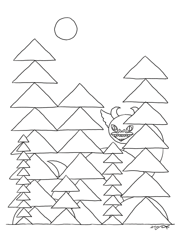
I decided to play with ideas from two of my earlier posts to demonstrate how to use contrast in your drawings. In my paper-cutting experiments, I noticed that I could quickly experiment and construct images from simple shapes. And with my meditative drawings, I found some level of relaxation from creating a repetitive texture. My base drawing for this experiment combines those illustrations in a drawing of a dragon in a wooded area.
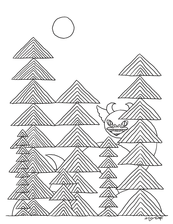
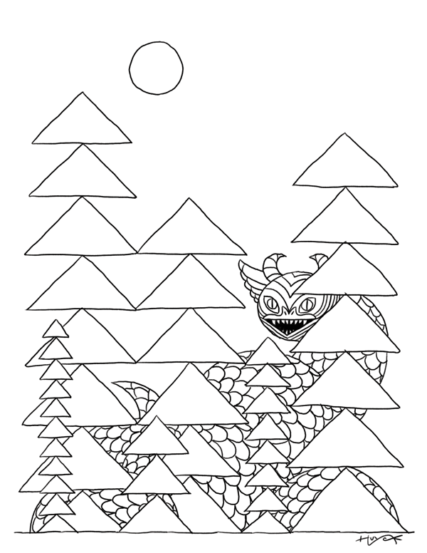
Creating contrast with texture
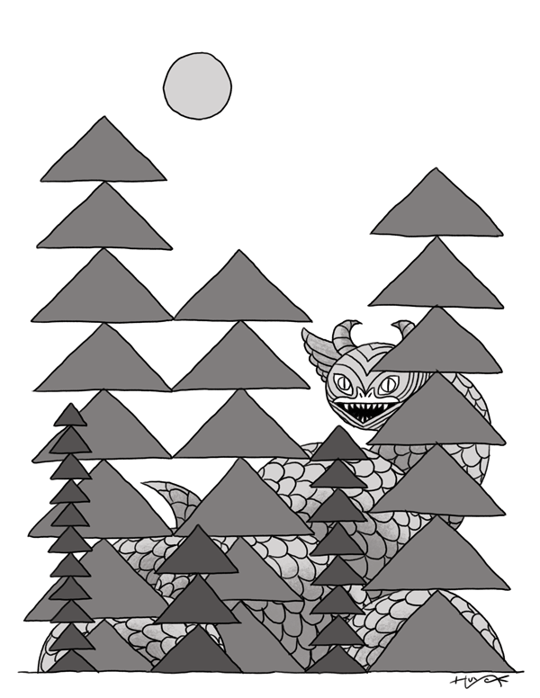
In the first example, I’ve added texture to only the trees in the base drawing, which clarifies the difference between the trees and the dragon. But adding texture to just the dragon makes it stand out even more.
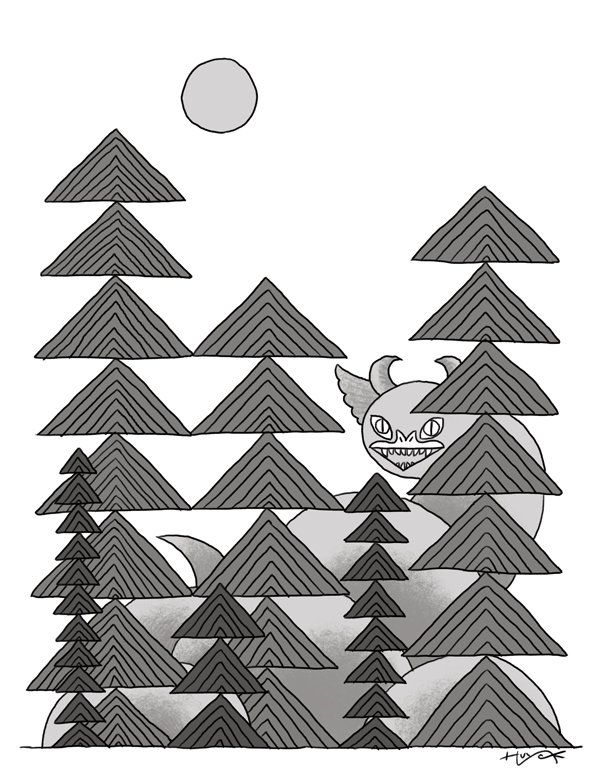
Creating contrast with value
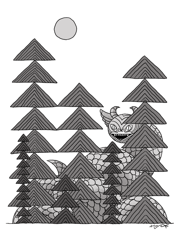
Next, I added varying shades of gray. With the tone, the shapes are clearer, so the texture in the trees or the details on the dragon makes little difference. That is, in both cases, the dragon is visually different enough to make it stand out.
Adding texture to both the trees and the dragon mutes that contrast again. However, the added definition from the shading combined with the textures gives the image new depth. While the contrast is not as stark, this may still be a good solution to a particular illustration puzzle.
Creating contrast with color
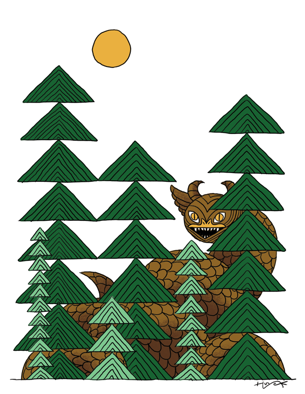
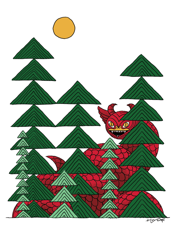
Finally, I used the blunt instrument of color to maximize the contrast. In the first example, I’ve kept the dragon in some yellows and browns — analogous colors to the trees’ greens. But in the final image, I popped the dragon out of the background with contrasting bright red scales.
These are all, of course, simplified examples to illustrate the point that contrast is a great way to capture the viewer’s attention. With a bit of experimentation, you can find countless ways to draw viewers’ eyes where you want them to be.

Share tips, start a discussion or ask one of our experts or other students a question.
No Responses to “3 Easy Ways to Add Contrast to a Drawing”