
Here are a 5 key tips for selecting fabric with eye-catching contrast.
Tip #1: Be fearless.
I struggled with contrast for a long time, until one day a quilt teacher threw a bright green fat quarter my way and said, “Add this into your mix.” I shook my head thinking, “That’s crazy!” But, good student that I am, I did as I was told. When the quilt was all finished, my instructor was right! That bit of bright green added a “sparkle” to my quilt. Without it, my quilt top would have appeared a bit flat and uninteresting.Tip #2: Go bold.
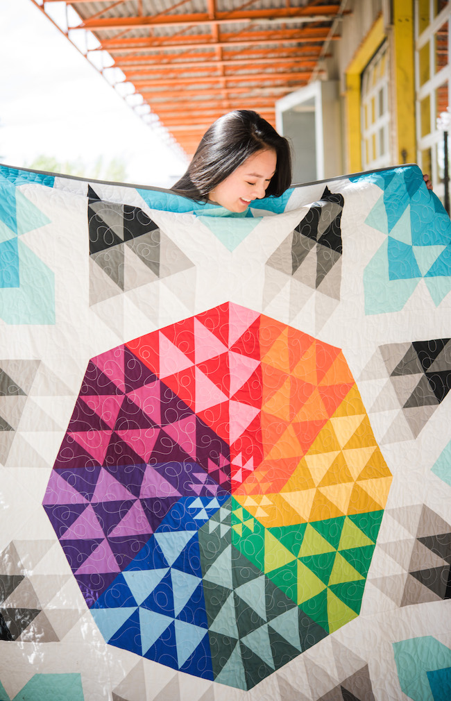
A common suggestion to consider when choosing the right combination of fabrics for a quilt is to have a variety lights, mediums and darks. This will add depth and contrast. Don’t be afraid to add a touch of the brightest brights or the darkest darks in your quilt too!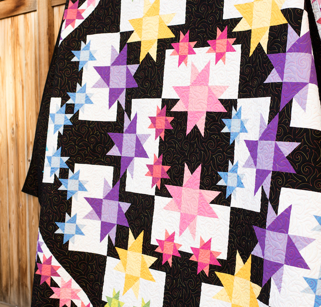
Tip #3: Take a step back.
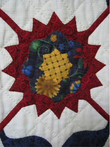
Years ago, I made this floral appliqué quilt. My “sparkle” is the brighter blue fabric, adding an extra pop of color to create interest throughout the quilt.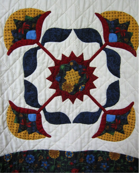
 When auditioning fabrics for a quilt and specifically for individual quilt blocks, many times fabrics will appear to have the perfect contrast when viewing them close together. However when you step back away from the chosen fabric, a completely different view is revealed.
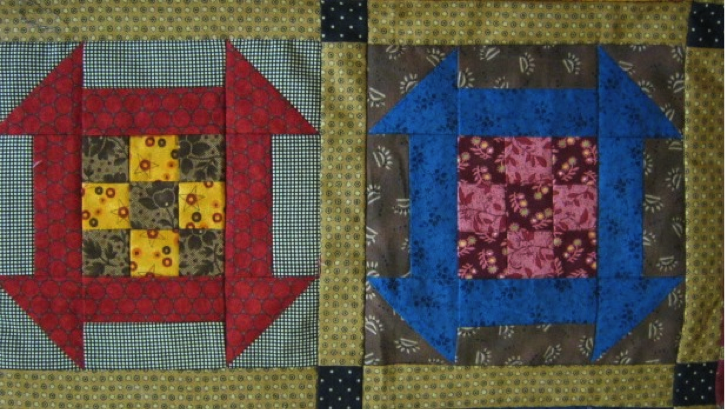
The block on the left has great contrast. The block on the right has very little contrast in the middle 9-patch, and the contrast diminishes the farther away one views the quilt.
When auditioning fabrics for a quilt and specifically for individual quilt blocks, many times fabrics will appear to have the perfect contrast when viewing them close together. However when you step back away from the chosen fabric, a completely different view is revealed.
The block on the left has great contrast. The block on the right has very little contrast in the middle 9-patch, and the contrast diminishes the farther away one views the quilt.
Tip #4: Mix prints.
Contrast can also be achieved with small and large print fabrics. Here’s an example of a big and small prints mixed in contrast.
Share tips, start a discussion or ask one of our experts or other students a question.
No Responses to “Make It Sparkle! 5 Tips For How to Achieve Contrast in Your Quilts”