
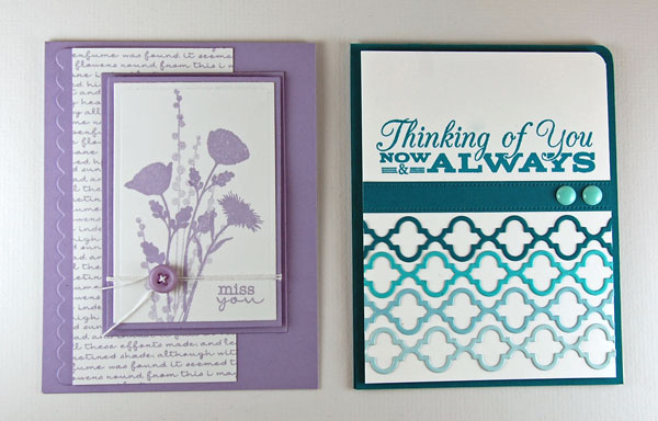
Monochromatic color schemes are known to be peaceful, calming and “easy on the eyes.” These design ideas for cards use one color but also incorporate various shades and tones of that color throughout.
These shades and tones are often comprised of a dark, a light, and one or two shades in between. Think of a paint chip you might see in a home improvement store. These varying shades are often complimented by a neutral, such as white, cream, gray or black. A neutral is important because without it, a design can become monotonous, or in cardmaking the focal image may be lost in a sea of color. A neutral helps balance the overall composition.
In just a few steps, I will show you how to create monochromatic cards using two methods.
Tutorial #1: How to create a monochromatic design with one ink
My first example uses one ink to achieve varying shades of one color.
Supplies you’ll need:
- Color card stock (I used Wild Wisteria)
- Neutral card stock (I used Smooth White)
- Ink to match card stock (I used Wild Wisteria)
- Floral stamps/sentiment (I used Peaceful Wildflowers and Pretty Poppies)
- Scrap paper
Step 1:
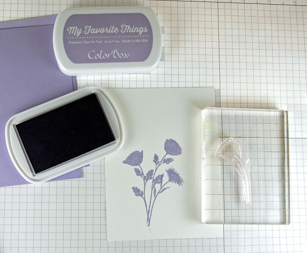
Stamp flowers onto white card stock.
Step 2:
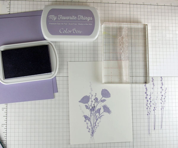
Ink the long/thin stamp and stamp off once onto scrap paper. Without re-inking the stamp, stamp over center of flowers. By stamping off once after inking, the next impression is a lighter shade of ink. Repeat inking and stamping off two more times, stamping to the left and to the right of center stem.
Step 3:
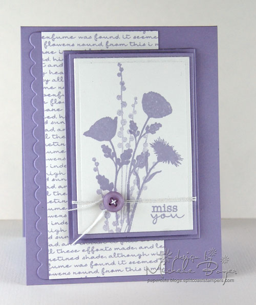
Stamp sentiment and finish card as desired. To balance the card design, I stamped a panel of white (neutral) using the coordinating ink and a script background (from Pretty Poppies by My Favorite Things). The neutral panel helps to lighten the overall feeling of the lavender base.
Tutorial #2: How to create monochromatic design using gradient shades
My second sample uses gradient shades of card stock to create another monochromatic look. While the dominant color is somewhat dark and bold, the design remains tranquil and pleasing to the eye.
Supplies you’ll need:
- Four gradient shades of card stock (I used Tropical Teal, Blu Raspberry, Berrylicious and Sno Cone)
- Neutral card stock (I used Smooth White)
- Ink to match dominant shade of card stock (I used Tropical Teal)
- Sentiment stamp (I used Grand Greetings)
- Border die (I used the mid-size die from Moroccan Tile Trio)
- Die-cutting machine
- Adhesive
Step 1:
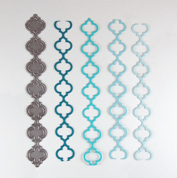
Die cut four border strips from gradient shades of card stock. For a standard A2 top-folding card, you will not need full length strips. (I used card stock scraps.)
Step 2:
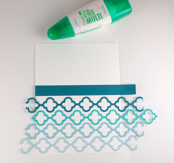
Beginning with the lightest shade, adhere strips to bottom portion of white card stock block. Stagger each strip within the one before, going from lightest shade to darkest as strips are adhered. Tip: When planning your design, it is helpful to lay out the pieces and move them around to see which order/layout you prefer.
Step 3:
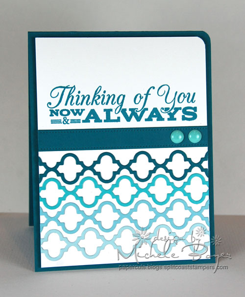
Trim border ends even with white card stock edges. Adhere card stock strip above die cuts, stamp sentiment and finish card as desired.
Share tips, start a discussion or ask one of our experts or other students a question.
No Responses to “Shades of (One) Color: How to Make Monochromatic Cards”