
Have you tried to choose a new toothpaste recently? Maybe switch your laundry detergent? Wanted to buy a new salad dressing? There are so many options in the aisle that even if you narrow down your choices to a single brand, you still might have 10 or 12 options to choose from. This overwhelming wall of indecision is sometimes called the paradox of choice.
Once I have escaped the art supply store many dollars poorer (and several tubes of paint richer!), I have already faced my own crippling paradox of choice: What type of paint? Oil, acrylic, watercolor? What level of quality? And — oh my word! — what colors? Each decision we make chips away at our endurance to make more decisions, and soon decision fatigue sets in. And then I have to go back to my studio to face the blank page and create something? Oof.
Creative constraints
In my research and experience, the most productive artists are those whose practice is focused. Once we make some overarching decisions and then stick to the plan, we can achieve more within our self-created boundaries.
When I wrote about self-assignments, one of the underlying ideas was giving myself a creative playspace, where I knew what was “allowed” and what wasn’t. When the big decisions were set, I could explore many smaller decisions without wearing myself out. As long as I start with the right box, it is unexpectedly liberating to be in a box.
Limiting colors

One box that I often put myself into only has a couple colors available in it. This isn’t a new idea, of course. Look at any classically trained painter’s palette and you will see a distinct selection of colors. I almost always take it even further, and sometimes I work best when I have only two or three colors to work from.
There are many ways to experiment with a limited color palette. Here are a few ways to get started.
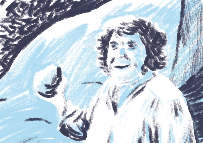
1. Light vs. dark
In my post about experimenting with crayons, I drew a fire hydrant using just purple and a yellowish-green. In the above image, I’ve again chosen a dark color and a medium color to represent the darkest shadows and the middle values respectively. I could have easily drawn this with blacks and grays, but the hues add another dimension to the picture.
And by swapping out the selected colors, I can further change the feel of the finished work.
2. Colors that mix well

Colors that can blend to create new, rich hues are fantastic choices for limited palette work. This way, two colors can be used to make a palette of three or more colors. The caveat, of course, is that your chosen medium needs to overlay and mix for this to work properly. Opaque colors won’t work right. This sort of image feels a lot like traditional printmaking (in fact it is called “overprinting”), and it is a great way to extend a limited palette in the right contexts.
Even when using black and a single color, overprinting can create what is called a “rich black” — that is, a black that is darker than a single black ink can create at one pass.
3. Tone and pop!
Another way to limit your palette is to work almost entirely in grays, black and white, or linework, and then add color to the areas that you want to stand out. This works well with just a single color, or sometimes two. The resulting image leaves little room to ignore the intent of the artist. It is basically the artist saying, “Look right here!”
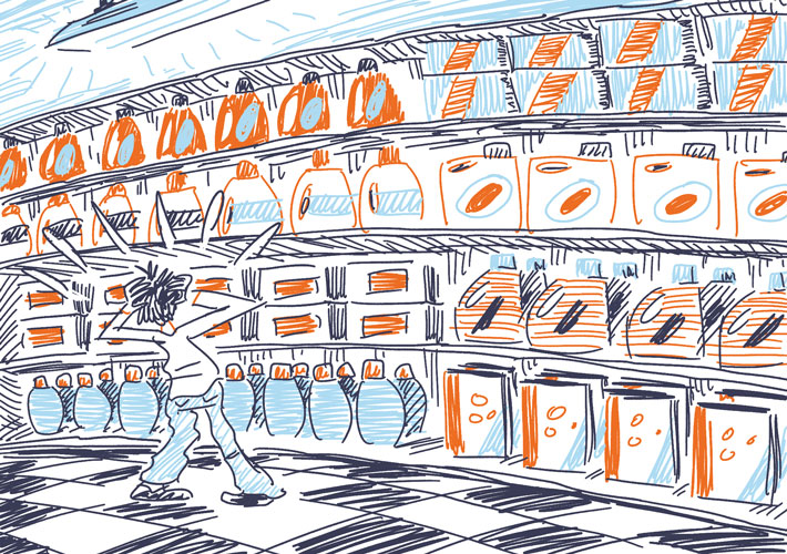
4. Graphic effect
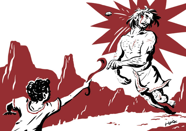
Taking the “pop” factor to its next level — or perhaps amplifying the “light vs. dark” idea as far as it will go — is working with single bold color and black. In this case, you break down the darkest third (or half) of the values in your image and default them to black. No grays allowed — nothing wishy-washy like that — just black. Then, take the midtones (or lighter tones) and replace them with your bold color, creating “pop” just like before.
One master of this look is Toronto artist Michael Cho, and you’ll find lots of inspiring examples on his site. This technique is easy to experiment with, too: all you need is a highlighter and a felt-tip marker. Leave the lightest portions of your image as plain white, then draw in your shadows in with the marker, before finally adding the highlighter for tone. With its dramatic lighting effects, this look is much like the style of old posters or comics, and the effect is striking and eye-catching.
Bonus: Turn it up to 11
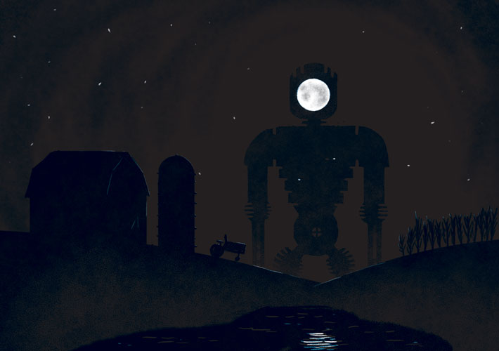
Finally, if you feel like pushing it all the way, you can take the limited palette to its logical extreme: pare down to just one color and you can make something quite bold.
Share tips, start a discussion or ask one of our experts or other students a question.
No Responses to “4 Ways to Use a Limited Palette for Dramatic Artwork”