
 When we paint subjects from the natural world, we often need to use hues that are more neutral than the vibrant colors of the basic color wheel. Often, when trying to mix them, or use colors that are pre-mixed in the tube, we come up with a lifeless, dull color that doesn’t react harmoniously to the other pigments in our paintings.
If we instead mix our neutrals with the vibrant and transparent pigments, we can create luminous neutrals that sing off the page when combined with brighter hues from our palette.
When we paint subjects from the natural world, we often need to use hues that are more neutral than the vibrant colors of the basic color wheel. Often, when trying to mix them, or use colors that are pre-mixed in the tube, we come up with a lifeless, dull color that doesn’t react harmoniously to the other pigments in our paintings.
If we instead mix our neutrals with the vibrant and transparent pigments, we can create luminous neutrals that sing off the page when combined with brighter hues from our palette.
The key to mixing luminous neutrals comes from the complementary colors on the color wheel.
 Complementary colors reside across from one another on the wheel, and serve to enliven one another and to create the best muted neutrals and shadow tones. In simplest terms, a complementary color consists of one primary (such as red) and one secondary that falls on the opposite side of the color wheel (such as green).
You can also explore other more nuanced complementary colors created with pairs of secondary and tertiary colors that are opposite on the color wheel, such as red-violet and yellow-green. There are so many combinations to try, but for now we will stick to the basic primary and secondary colors.
Complementary colors reside across from one another on the wheel, and serve to enliven one another and to create the best muted neutrals and shadow tones. In simplest terms, a complementary color consists of one primary (such as red) and one secondary that falls on the opposite side of the color wheel (such as green).
You can also explore other more nuanced complementary colors created with pairs of secondary and tertiary colors that are opposite on the color wheel, such as red-violet and yellow-green. There are so many combinations to try, but for now we will stick to the basic primary and secondary colors.
The basic complementary pairs are :
- Yellow and violet
- Orange and blue
- Red and green
3 ways to mix luminous neutrals
For this exercise, I gathered a selection of Winsor & Newton primary color pigments (yellow, magenta and cyan).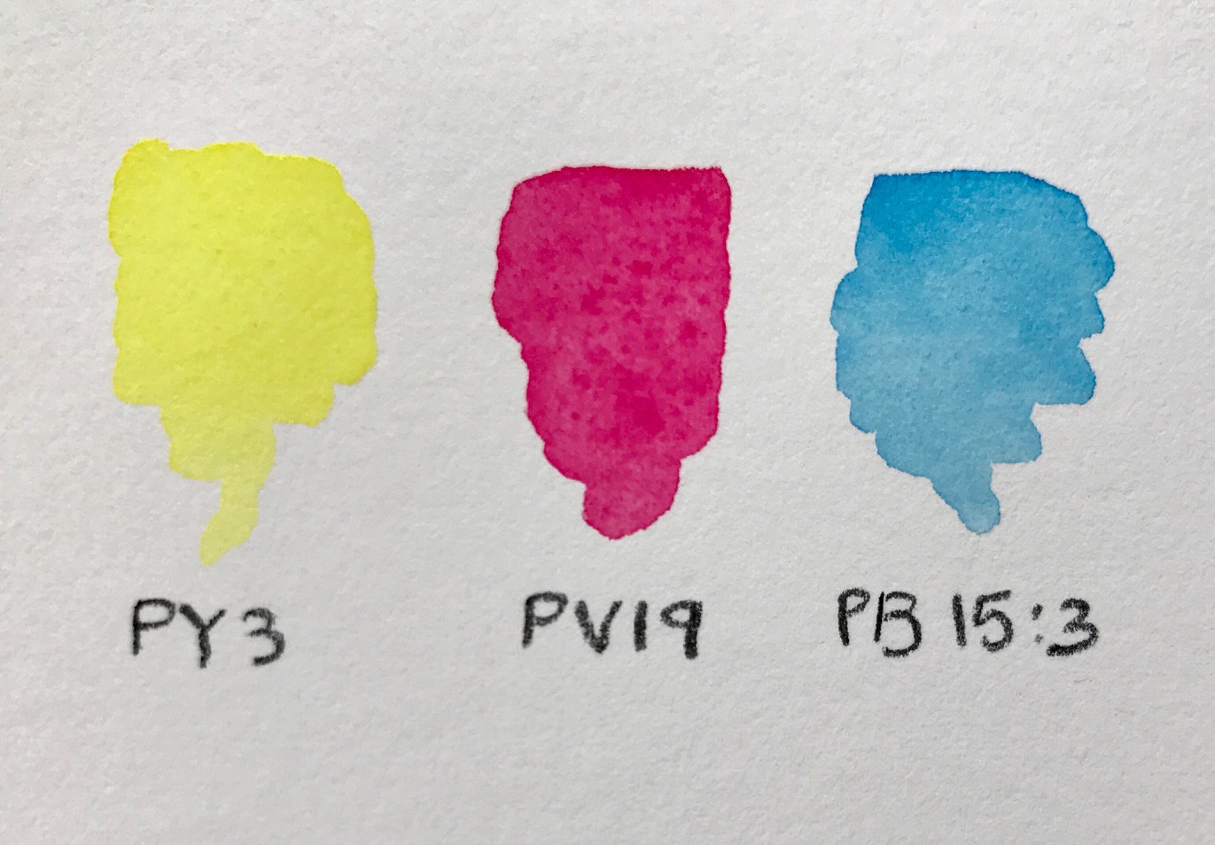 Specifically, these are the pigments I used:
- Yellow: Hansa Yellow Light PY3
- Red: Permanent Rose PV19
- Blue: Winsor Blue GS PB15:3
Yellow and violet
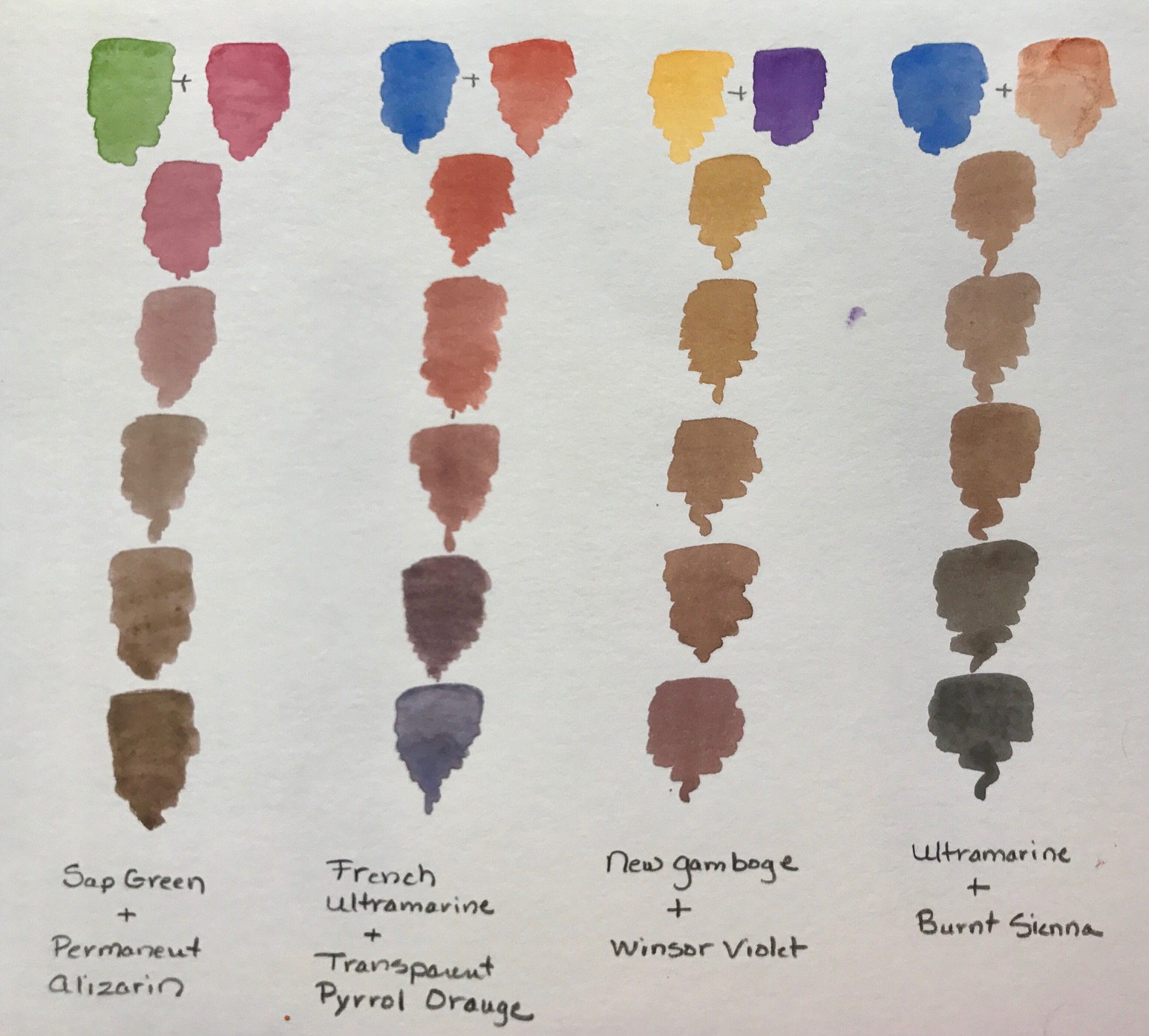
First I mixed the red and blue to create a violet hue. Then I added the yellow to my palette. Once I had the two colors on my palette, I began adding small increments of violet to the yellow, creating a subtle color shift that resulted in many neutral tones. In the image above, you can see the progression from bright yellow to a yellow ochre to a glowing warm olive to a luminous warm gray.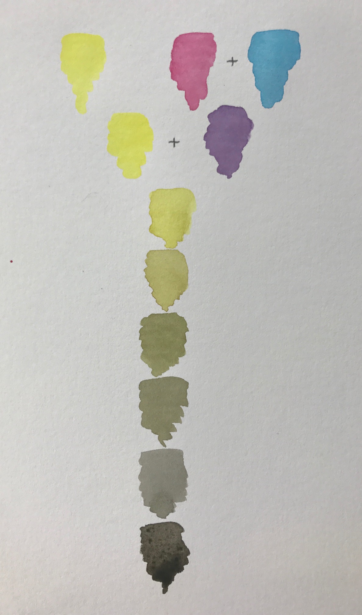 You can try this with any other yellow pigments on your palette. Each one gives you a different result and an amazing array of neutrals at your brush tip.
Orange & blue
First I will mixed a vibrant orange using yellow and red. Then I added increments of the blue the orange mixture on my palette, and swatching each new hue down my chart.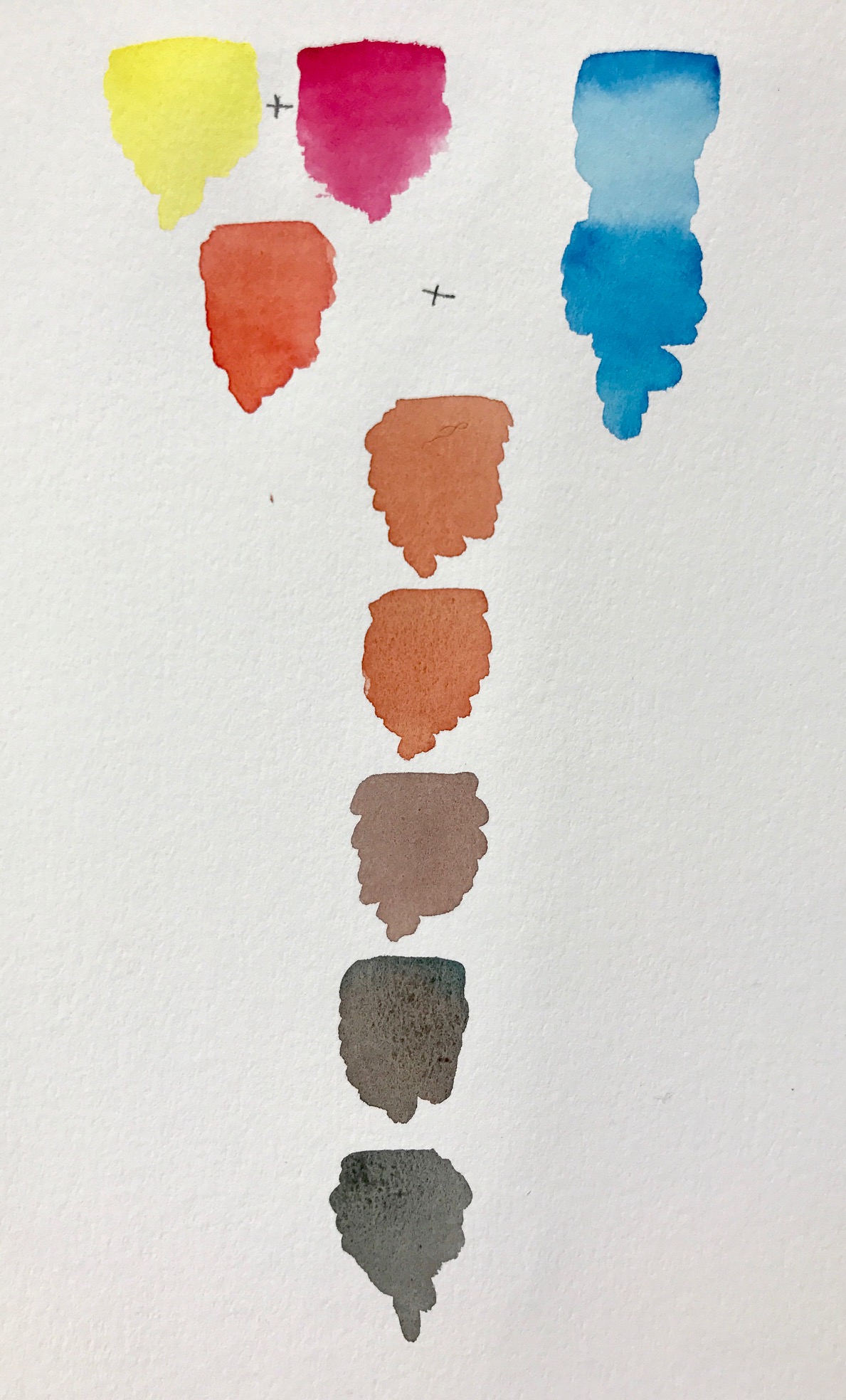 Here, you can see a gradual shift from brilliant orange to a warm rusty brick, to a burnt sienna hue, to a warm chestnut brown, a rich burnt umber and finally a glowing, soft charcoal black.
Depending on the amount of pigments in your mix, you can even achieve the deepest black imaginable by simply using a combination of orange and blue.
Here, you can see a gradual shift from brilliant orange to a warm rusty brick, to a burnt sienna hue, to a warm chestnut brown, a rich burnt umber and finally a glowing, soft charcoal black.
Depending on the amount of pigments in your mix, you can even achieve the deepest black imaginable by simply using a combination of orange and blue.
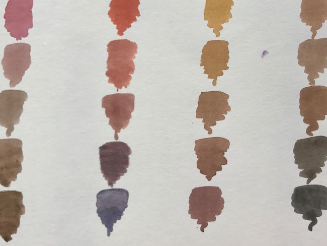
Red & green
I’ve created a green mix using my blue and yellow, and then created a variety of neutrals by mixing increments of green into my red.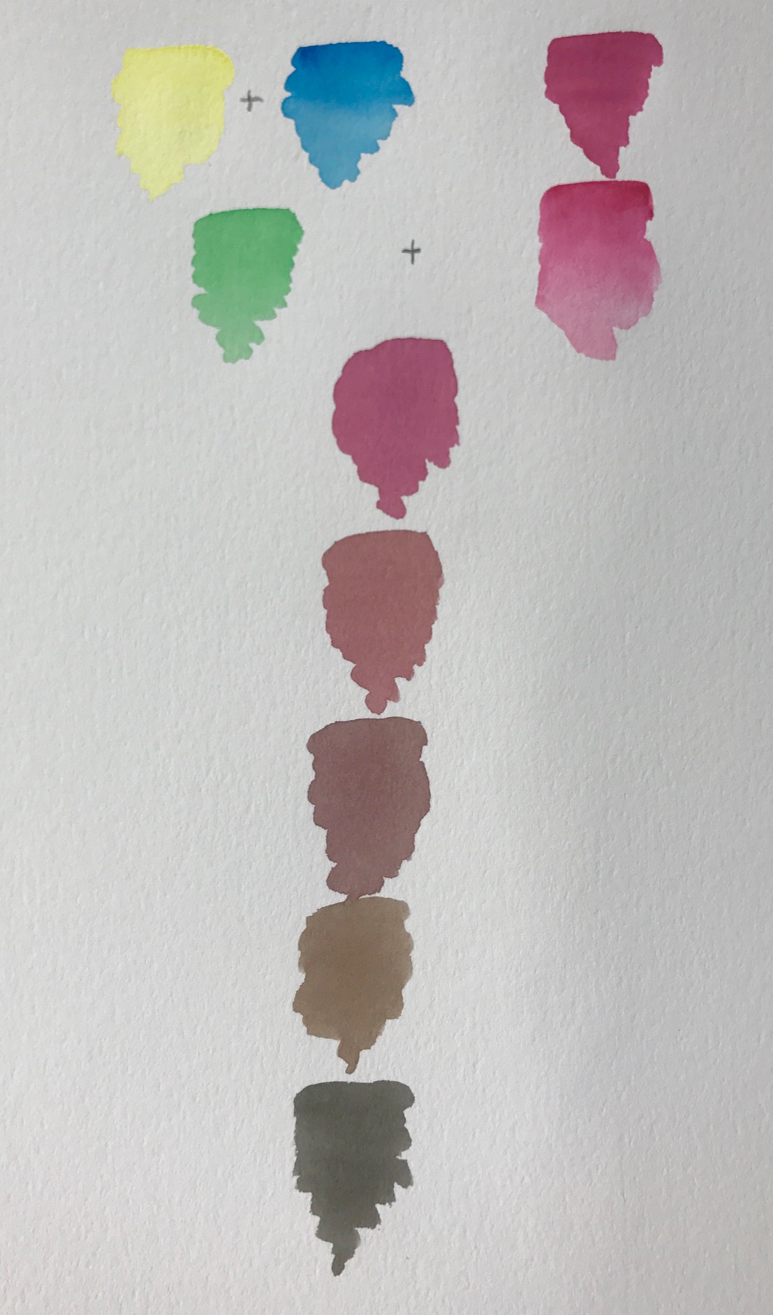 Here, the color goes from a vibrant magenta red to a rich muted raspberry, a dusty plum, and earthy brick, a bark brown and finally a deep sepia hue.
All of these gorgeous neutrals mixed with just three pigments!
Here, the color goes from a vibrant magenta red to a rich muted raspberry, a dusty plum, and earthy brick, a bark brown and finally a deep sepia hue.
All of these gorgeous neutrals mixed with just three pigments!
More complementary color mixes
 As you can see, simply swapping out the specific pigment can have a big effect on the colors you can create. And these are just a small sample of possible combinations.
Any pair of complementary colors will mix into a multitude of beautiful neutrals. We don’t need a huge assortment of paints to create a myriad of neutral colors for our paintings. The rainbow of brilliant primaries and secondaries is they key!
I hope you will try out many colors you already have on your palette and see that neutrals don’t have to be difficult or boring.
As you can see, simply swapping out the specific pigment can have a big effect on the colors you can create. And these are just a small sample of possible combinations.
Any pair of complementary colors will mix into a multitude of beautiful neutrals. We don’t need a huge assortment of paints to create a myriad of neutral colors for our paintings. The rainbow of brilliant primaries and secondaries is they key!
I hope you will try out many colors you already have on your palette and see that neutrals don’t have to be difficult or boring.
I am a member. I am locked out and cannot access my classes. ghchilton@gmail.com