
Have you been diligently practicing your calligraphy strokes and letters, copying the exemplars exactly? Learning from the experts is fine, but at some point, you’ll want to add a little more “you” into your calligraphy. Here are my tips on how to add that personal je-ne-sais-quoi to your calligraphy!

Master Modern Calligraphy
Join Laura in her online class, where you’ll learn essential calligraphy exercises and techniques.
First, take a close look at your regular handwriting.
This exercise will give you an idea of where you can naturally add individuality to your own handwriting — and therefore where you could add it to your calligraphy!
Step 1: Write
Start by grabbing a regular ballpoint pen or pencil. Write out a few lines of your everyday cursive handwriting.
If by chance you haven’t done any cursive handwriting since around the time your bike had training wheels, don’t worry! Just write out a few extra lines and words till you feel comfortable with cursive again!
Step 2: Analyze
Now, look closely at the components of your handwriting in your cursive sample.
- Are your letters tall and thin or short and fat?
- Do you have much space between your letters, or are all your letters tightly linked?
- Do you naturally add any flourishes to your handwriting, and if so, where?
- What do your ascenders and descenders look like? (Ascenders and descenders are any strokes that extend above or below the main writing line)
- Do all your letters sit nicely on the writing baseline, or do they jump around, up and down?
Step 3: Find opportunities
Based on the observations you made in the last step, can you find any inspiration on how to add your handwriting personality to your calligraphy?
For example, if your handwriting is naturally very low and elongated? If so, you may wish to add the same effect to your calligraphy. Try long oval shapes, a very low x-height and a strong right slope.
Or, does your handwriting have a strong left slant? Perhaps you would like to try that why your calligraphy for a unique look.
Taking a close look at how you naturally write is an interesting way to add uniqueness to your calligraphy. Once you have an idea of your handwriting’s personality and how you can apply it to your hand-lettering, let’s get started!
Grab your pen & ink!
With your pointed pen in hand, pick a word — any word. For this exercise, take one of the following approaches:
- Pick a style from the list below that’s most in line with your own handwriting peculiarities
- Try every option on this list and stick with the one that feels most natural to you
- Just go with whichever style most appeals to you (that’s part of your personality, too)
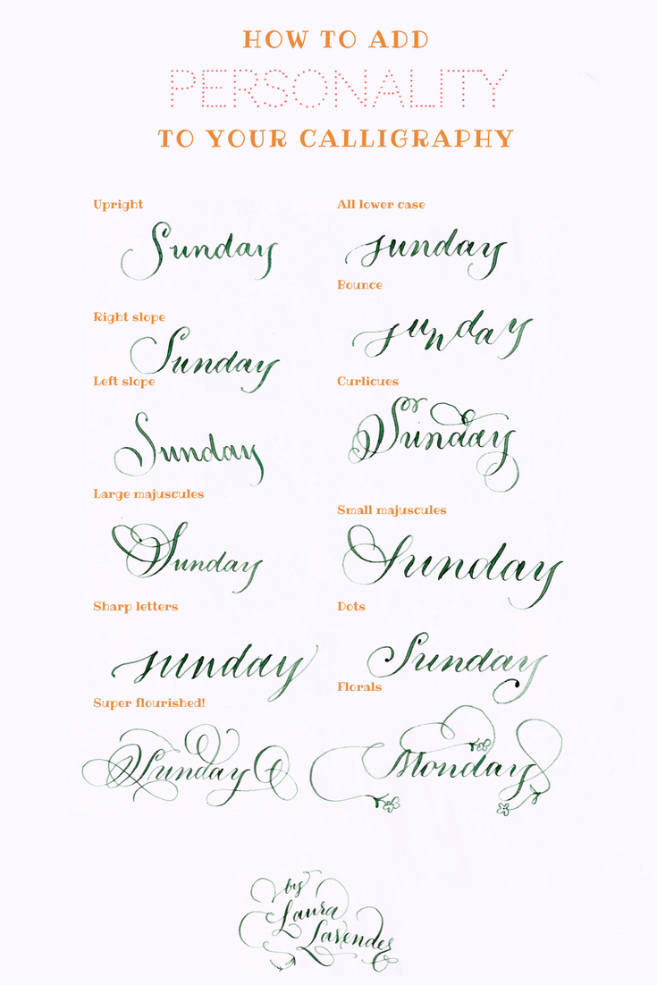
I put together this image with a variety of pointed pen lettering styles. This is a good starting point, but know that this is not an exhaustive list of calligraphy styles.
Here’s a little bit more about each style, starting from the top left of the image, and working down:
- Upright: The letters remain vertical throughout.
- Right Slope: In this classic variation, the letters slant to the right, as in traditional copperplate.
- Left Slope: The letters sit at a steep angle to the left.
- Large Majuscules: This style uses a very large capital letter, about five times the size of the small letters.
- Sharp Letters: These letters have sharply pointed angles on all the normally rounded letters, adding a modern look to pointed pen calligraphy.
- Super Flourished: Dramatic swoops and swashes appear on ascenders, descenders and exit strokes for an over-the-top look.
- All Lower Case: Writing all your letters in lower-case lends a casual unpretentiousness to your calligraphy. Try this style with unflourished, simply structured letters.
- Bounce Letters: This trendy look has alternating letters above then below the baseline (the writing line).
- Curlicues: These letters have decorative curly-swirly flourishes.
- Small Majuscules: In this style, majuscules the same size as the lower case letters for a different look.
- Dots: Exit strokes are capped off with a copperplate-inspired dot.
- Florals: Try extending your flourish into a romantic floral embellishment.
Which style most speaks to your personality? Share in the comments!
Master Modern Calligraphy
Join Laura in her online class, where you’ll learn essential calligraphy exercises and techniques. Get the Class!
Being an Army brat instilled in me a love for variety in everything including my handwriting.
Small majuscules and Curlicues