
Bowl design is a very subjective thing so what pleases the eye of one may not for another. That being said, there are a few conventions that generally hold true and are at least a good starting point when coming up with a design that will suit your esthetic and practical objectives. Once you get comfortable with these rather pliable tenets, you will have also learned when and where to break them.
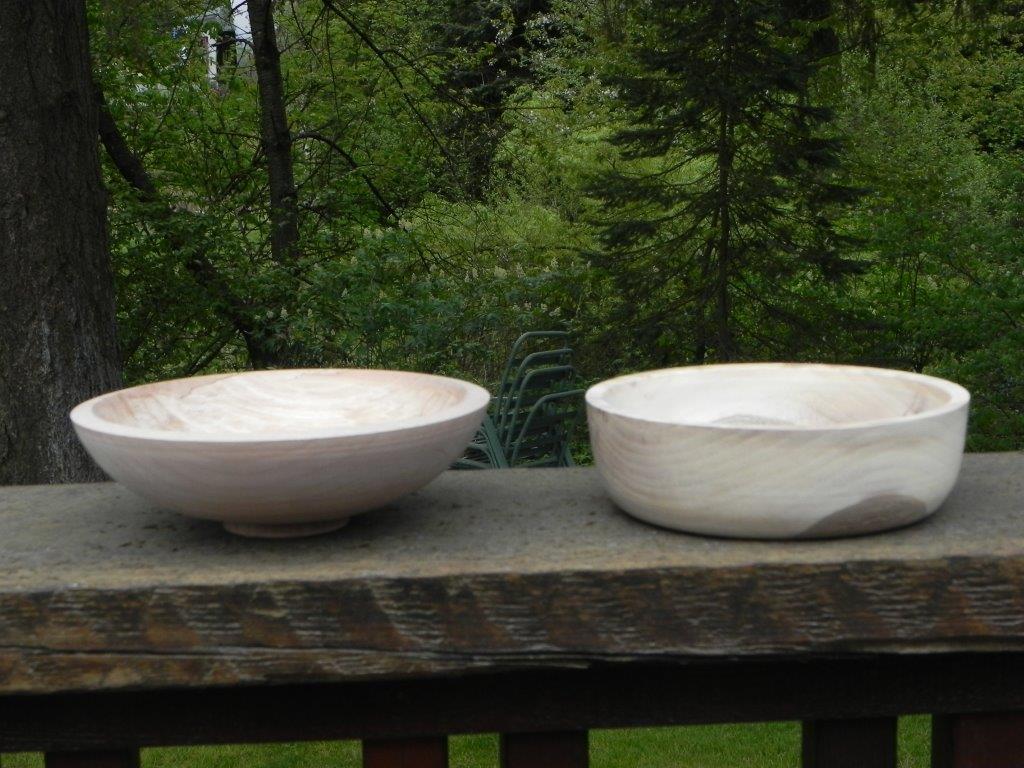
The flat, steep-sided bowl below on the right is a classic design usually employed by a novice turner. This may be because of a desire to maximize the volume of that $10 blank but more than likely I feel the project was started with no particular design in mind.
Here are a few tools to help you with your woodturning design.
1. What is the “right” curve?
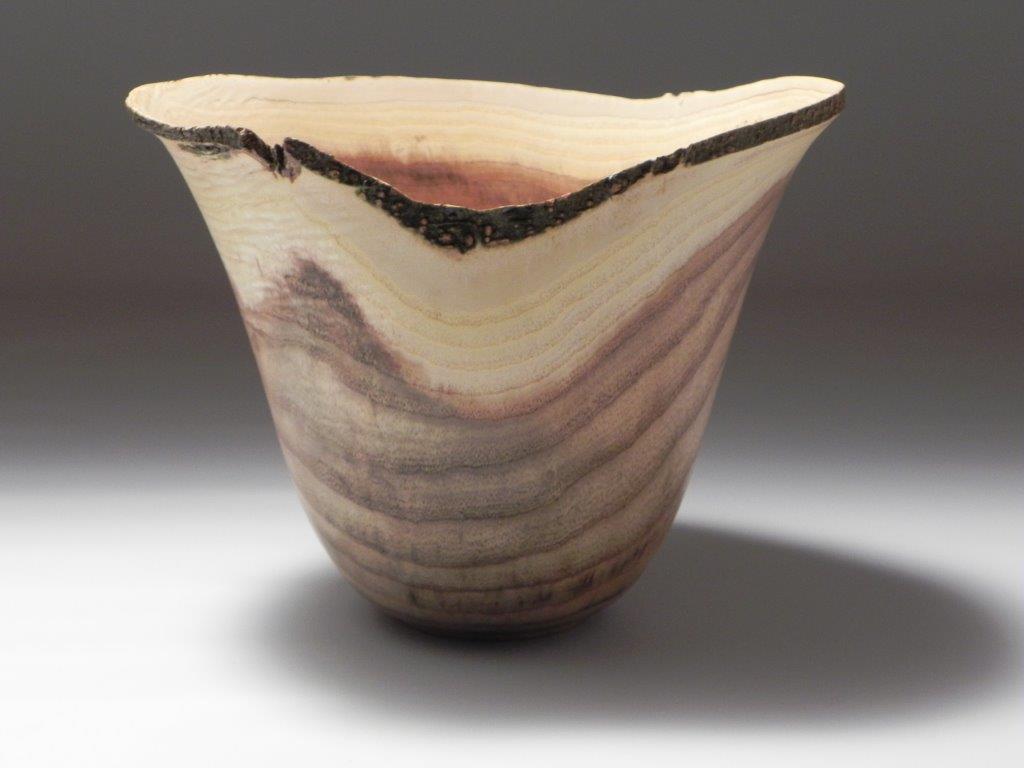
One convention is that the curved line of a bowl is more appealing if it approximates a catenery curve. A catenery curve is formed if you hold a light chain by its ends and let it droop. Whether deep or shallow (slack or taut), the line formed is called a catenery curve. We seem to be drawn to that shape and one of the theories is that we see that shape everywhere around us: vines, ropes, power lines, gondola lifts, a simple gold chain around a lady’s neck. Along with that is another tenet that is, for the most part, true. If that curve appears to complete above, on or just below the support surface, the form will have a lighter appearance. The profile of the bowl on the left in the photo below is an example of that curve completing above the surface (assisted by the small foot — more about that later).
2. Ease of turning is an added bonus
There is a bonus to the form on the left above. It is far easier to turn than the the flat-bottomed piece. The flat-bottomed piece has a tight radius at the transition from side to bottom on the inside. When rounding that bend, the shank of the gouge will “ground out” against the rim of the bowl and cause the bevel to come off the work, resulting in the loss of control of the cut. The bevel will only regain contact with the surface part way to the center so there will be a very rough cut from side to almost center. Add to that, a flat bottom is very hard to do well. Should you want this design (and there may be a very valid reason), the answer is to use a gouge with a very steep angle (say, 45 degrees at least). This will stand the tool straighter up, keeping the shank away from the rim at the transition from side to bottom.
Contrary to all this, the bowl with the simpler curve is much easier to turn, having a curved bottom and no issues with the shank of the tool coming in contact with the rim on it’s path around the curve. Additionally, there are no sudden changes in direction throughout the cut, only a smooth transition from rim to center.
3. The catenery curve works everywhere
The catenery curve notion works for rather flat bowls (above) and also tall vase forms as well. However, in the photo below, note how the sides of the hollow form head straight into the table. If these are the sides of a curve the bottom of the curve is well below the table. Though not necessarily heavy in appearance, the foot becomes very prominent and generally conflicts with the curved lines of the rest of the piece.
The hollow form below has a curve near the foot that closes very close to the support surface. When viewed from a slightly elevated angle, the foot isn’t visible and the piece appears to actually float above the table. How is that for lightness? Quite a difference from the last example.
4. Curves should not have bumps or flat spots
The subconscious mind is an incredible thing. It does calculations without you even knowing it. It spots anomalies with the eye or hand and lets you know something is wrong before you can consciously determine there is a problem at all. Curves are subtle things that can fool you. When making your final cuts especially, always watch the profile of the curve develop by watching the top of the form. I call this “watching the horizon.” Be super critical of your progress, watching for sudden changes in radius when you move too quickly or flat spots where you paused momentarily as you “round the corner.” Bumps are easier to spot while minute flat spots are tough to pick up. Usually you will feel them with your hand before you will see them with your eye. Take the piece, chuck and all, off the lathe and stand it vertically. You will be surprised how its true shape appears in that perspective.
Curves are rarely constant with one radius, so transitions to shorter or longer radii should be smooth and continual. The larger the vessel the harder it is to maintain a constant curve. In taller forms, like hollow forms, a curve that’s even a tiny bit too tight at the top, if continued, will make the vessel inches shorter than planned.
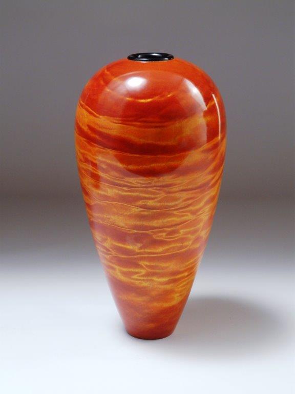
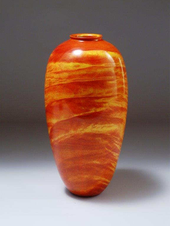
If you look very carefully at the top orange hollow form, the curve flows down toward the foot but just at the very last it ends in a short straight about 3/4″ long. It’s obvious on the right side. That was the very last piece that I turned like that and the foot is what I found so disappointing. The similar piece a few photos below was my very next piece (same wood, as a matter of fact). I learned my lesson and haven’t looked back.
By being self-critical every single time, you will develop a sense of when a curve looks “right” and when not. Remember: “Good enough isn’t.”
5. Base or foot
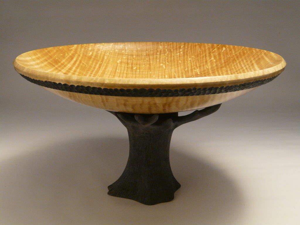
Another simple approximation that I (and others) use is that the diameter of the foot or base of a bowl should be about one third of the outside diameter. For various reasons you might keep it at that, make it larger for stability or smaller for extreme “daintiness” but it’s a good starting point. As in the photo above, a slight foot lifts the bowl off the surface adding to the appearance of lightness. It also helps the admirer to pick up a low bowl with both hands. Once a turning is cradled in someone’s hands they have made a connection with the form.
The base of a turning doesn’t always hide underneath the form. I turn large, three-sided forms that by their very nature could look like a stump on the table. By hollowing the bottom it allows the piece to sit on the three corners leaving a slight shadow line along most of the bottom. This very subtle feature allows the otherwise very heavy piece achieve a bit of lightness. Of course if weightiness is part of our theme, simply let the piece sit flat on the table to declare that fact.
6. The golden mean
The golden mean is a ratio derived from the Fibonacci progression and is expressed by the ratio of 1: 1.61803… Very roughly it is taken as about 5/8 of the height of a piece or even 2/3 of the height. You may have heard of “the rule of thirds” — this is it. Very simply put, if you have a feature such as a band or there is a maximum diameter, those features will make the piece more appealing if they are placed at about 1/3 or 2/3 of the height of the piece. For those of you who feel I should be more exact than this, please go with the general concept for explanation’s sake. For those of you who think this is bunk, take it up with the ancient Greeks and any successful artist since. Even abstract artists will employ the ratio if they see fit.
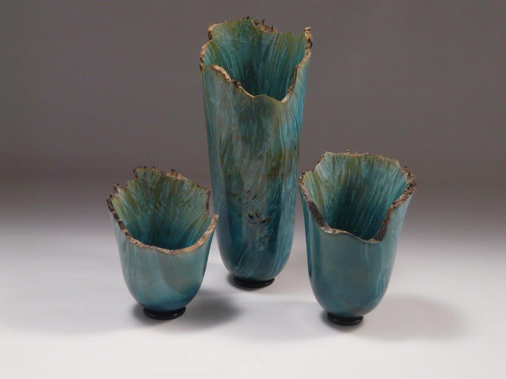
The major diameter of the hollow form above is at exactly 0.61 (1/1.61803…) of the height. Below, in the trio of vase forms the transition between the inward catenery curve and the outward flair is also at 0.61 of the height. Both form types drew a lot of attention and sold very quickly at a gallery show, unlike similar forms by another artist that were not as exact and somehow just looked “off”, according to one patron.
As an experiment, draw or turn a curved surface with a transition in it. Once you get it to where you feel it looks good, measure the position of the transition. I’d bet you a new bowl gouge that it’s right at the golden mean.
Believe it or not, the stone columns on your classic court house aren’t straight at all. The sides curve slightly and the largest diameter is exactly at the golden mean.
Your art degree is complete
While this by no means is a full degree, it is a fairly concise “Certificate In Design” as applied to woodturning. Every time I speak with someone who actually knows their chops when it comes to art and design I am humbled, but these simple concepts have allowed me to create some pretty decent stuff.
These basic concepts will stand you in good stead when creating the design of your form before your wood even goes on the lathe. Draw your idea. If you can’t draw, draw it anyway. It’s the first step toward familiarizing yourself with your new creation. If it doesn’t look so hot on paper, better to find out now rather than when most of the wood is on the shop floor.
Share tips, start a discussion or ask one of our experts or other students a question.
No Responses to “6 Woodturning Design Concepts That are Key to Success”