
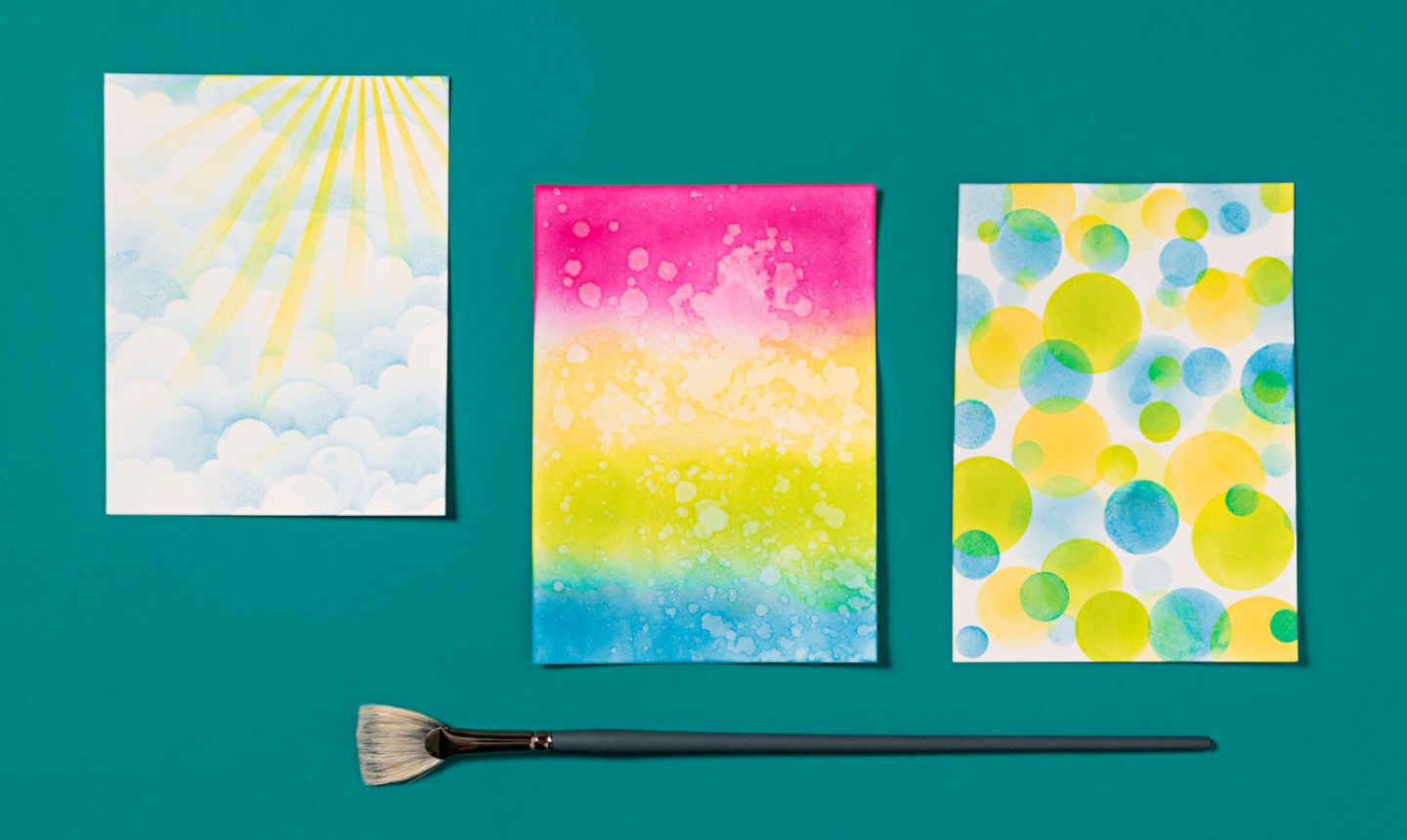
There’s so much you can do with distressed ink, but we love it best for crafting easy, arty backgrounds for cards and other paper crafts. Use these techniques as a starting point, and you might love the results so much you let the background stand alone. Or get fancy and layer on your favorite embellishments — it’s up to you!
Technique 1: Waterdrop Ombré Background
Level: Easy
What You Need
Pro Tip: If you don’t have Four Ranger blending tools, you can use cosmetic brushes, craft sponges or other ink application tools. It works best to have one applicator for each color, so you don’t have to clean in between.
Instructions
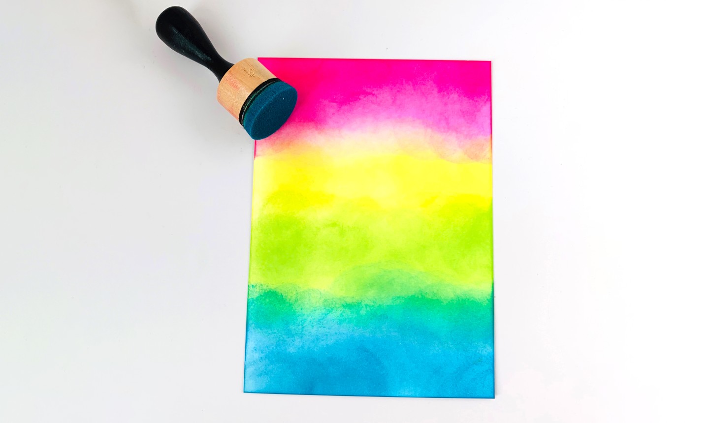
1. Ink the First Color
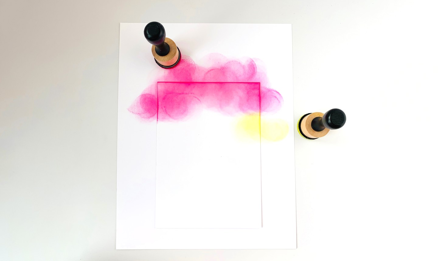
Apply ink to your blending tool by rubbing it over the pad multiple times. Beginning just off the card stock (on the scrap paper underneath) add ink by moving the tool across the paper in a circular motion, approximately the size of a quarter.
Work your way down the card stock, re-inking your tool as needed, until you’re about ¼ of the way down the card.
Pro Tip: Always start applying the ink on your scrap paper and move onto your white card stock. It helps prevent dark “splotches” in your blending.
2. Smooth Out Any Splotches
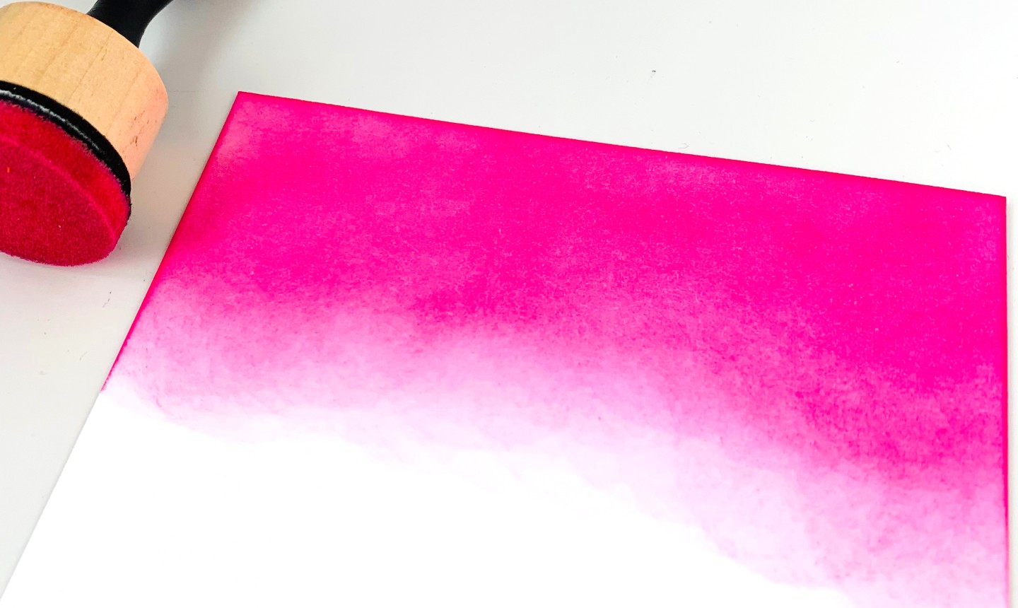
Splotches happen, but they’re easy to fix with just your blending tool. Simply use a circular motion to smooth out any uneven ink. You can also drag your tool across the paper to get rid of spots that are still wet.
3. Add the Next Color
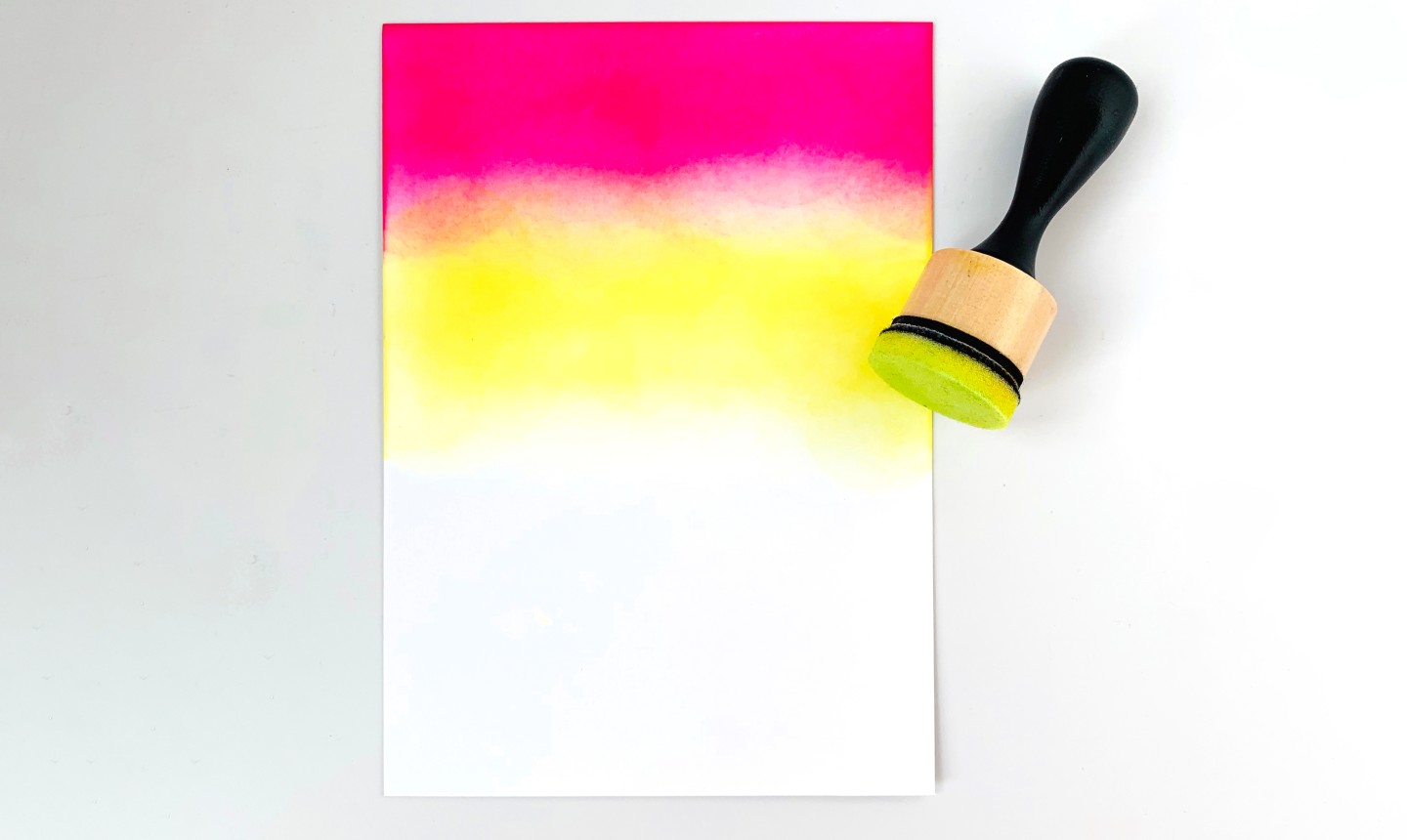
Ink a second tool in a new color and add it to the card stock. Use the same small circular motions when applying, and allow some of the second color to overlap and blend with the first.
Pro Tip: Plan to use colors next to each other that mix well. For example, pink and yellow will create an orange color, and yellow and blue will result in a green. Avoid placing complementary colors right next to each other, since they’ll make a muddy look when they blend.
4. Repeat
Repeat these steps using your third and fourth colors, until your card stock is covered.
5. Add Water
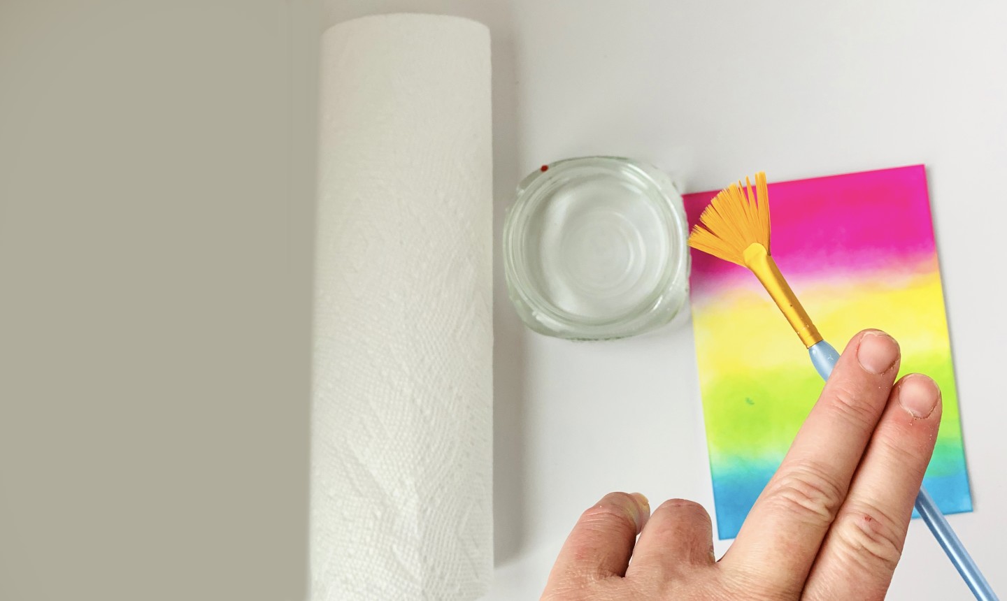
Dab a small brush in water and splatter it onto your card stock. There are different methods of splattering, but the easiest way for this project is to tap the brush with two fingers. We used a fan brush, but you can use any small brush you have on hand.
6. Dry the Card Stock
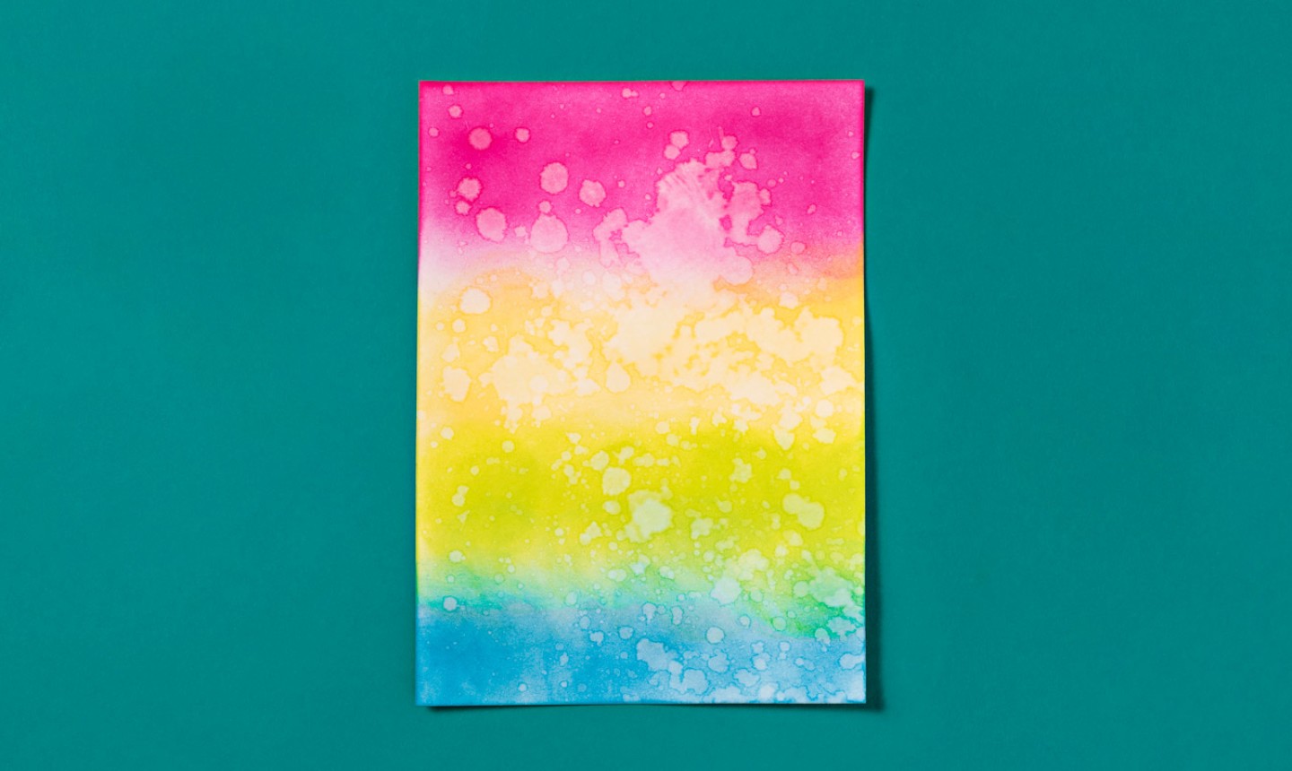
Once your water drops are applied, use a paper towel to absorb any excess moisture. Lay the towel directly down on the card stock, lightly press and lift it off.
You want to do this quickly so your card doesn’t warp from the water. Also, the drops help cover any imperfect blending — so if you didn’t manage to remove all your splotches in step 2, don’t sweat!
Pro Tip: Do NOT wipe the card with the paper towel. This will smear your design!
Technique 2: Bokeh Background
Level: Easy
What You Need
Instructions
1. Create a Stencil
Create a stencil of circles, all in different sizes. You can do this by using circle punches to make holes in a piece of scrap paper, like we did.
If you don’t have circle punches, you can trace different circular objects around your house onto scrap paper and cut out the inside of each circle.
Pro Tip: Keep your circles far enough apart so you have room to begin your ink blending around the edges of the scrap paper. This will help make your blending on the card stock more even and free of splotches.
2. Tape and Ink
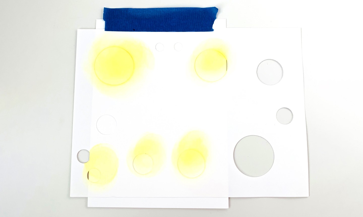
Tape the stencil over your cardstock and hold both in place as you blend ink over the circles. Pick and choose which circles to use to create a balanced look with your color placement.
3. Keep Inking!
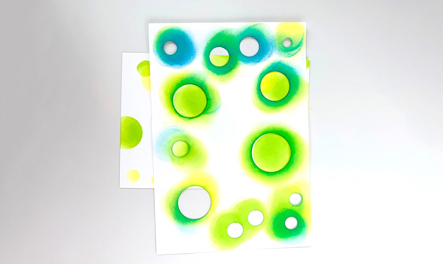
Repeat step 2 using each color. (We used Squeezed Lemonade, Twisted Citron and Mermaid Lagoon).
Pro Tip: Allow your circles to overlap to create dimension and new color combos. Make sure to alternate sizes, move your stencil as needed and add plenty of circles to your design for the coolest look.
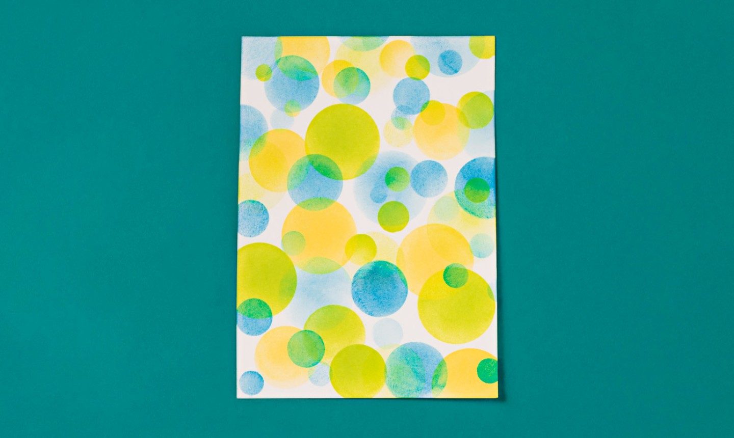
When you’re done, you’ll have a background that hits the spot!
Technique 3: Cloudy Sky and Sun Rays Background
Level: Easy
What You Need
Instructions
1. Create Cloud Stencils
Using scrap paper, draw round, puffy designs to mimic the tops of clouds. Create a few of these stencils to give your card some variation, and cut them out.2. Stencil Over Your First Cloud
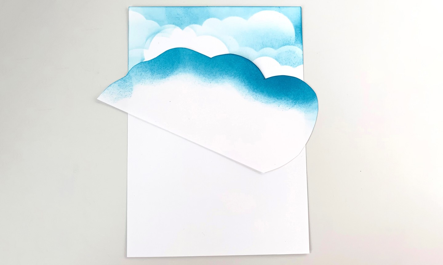
Beginning at the top of your card stock, place a cloud stencil and start inking. As always, apply the ink in a circular motion.
Pro Tip: Start with light pressure. You can always add more pressure for darker looks.
3. Stencil the Second Layer
Switch to another cloud stencil and place it so the fluffy edge is about 1 inch down from the last set of clouds. Add ink, again beginning on top of the card stock.
4. Repeat
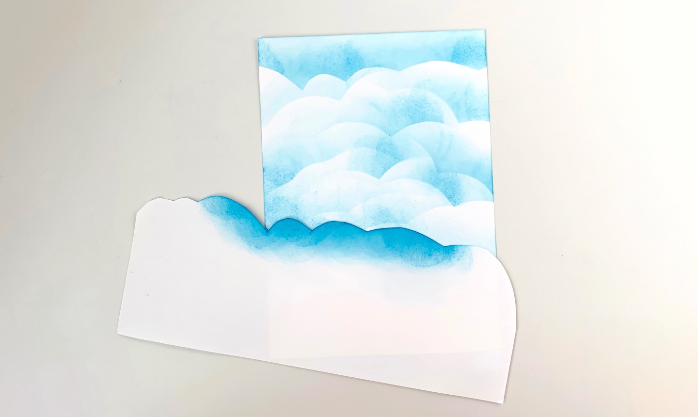
Keep working down your card stock until the entire surface is covered. Use varying pressure to change up the look of each layer, and play around with placing the stencils at different angles to make the most interesting design.
5. Bring On the Sun

To add sun rays, use Post-It notes (or more scrap paper) to create edges. Place the Post-Its a little bit apart from one another, with the space between the two edges widening as it goes down the card to create the ray effect.

Add yellow ink, working your way from the top of the ray down. As you get lower on your card, use less pressure so the yellow fades into the clouds.
Now just embellish these cards however you want, and you’re done!
Photos by Bobbi Lemanski.
Share tips, start a discussion or ask one of our experts or other students a question.
Already a member? Sign in
No Responses to “Craft Better Cards With These 3 Distressed Ink Techniques”